Team
Strategy: Zuzana Behova
Creative Direction: Tomas Nedved
Art Direction: Radek Dostal
Project Management (agency): Zuzana Behova
Project Management (client): Martin Zufanek
Photography: Julius Filip

Challenge
Great Moravia was the first significant state to emerge in the area of Central Europe and the territories now known as the Czech Republic, Slovakia, Austria, Germany, Poland etc. Its origin is inherently tied to Cyril and Methodius, two venerable Byzantine monks. In the 9th century, they were asked by the Moravian ruler Rastislav to spread religion in a language that could be understood by all.
The year 2022 marked the 1,200th anniversary of the first written mention of the Morava inhabitants, Moravians. To celebrate, the Regional Authority of the South Moravian Region teamed up with Zufanek, the most-respected Czech craft distillery, to produce 1,200 limited edition bottles of 12-year premium slivovitz.
For this once-in-one-thousand-two-hundred-year occasion, Little Greta was commissioned for the design.
Concept
Some of the most notable turning points in the Czech history were depicted in the so-called Slav Epic. Painted by Czech painter Alphonse Mucha between 1910 and 1928, the cycle of 20 large canvases – some measuring over eight meters tall! – is a quintessential Art Nouveau masterpiece.
One of the canvases, the Introduction of the Slavonic Liturgy, captures critical moments of the foundation of Great Moravia. There are prominent scenes and figures, such as the Great Moravian rulers Rastislav and Svatopluk and Cyril and Methodius.
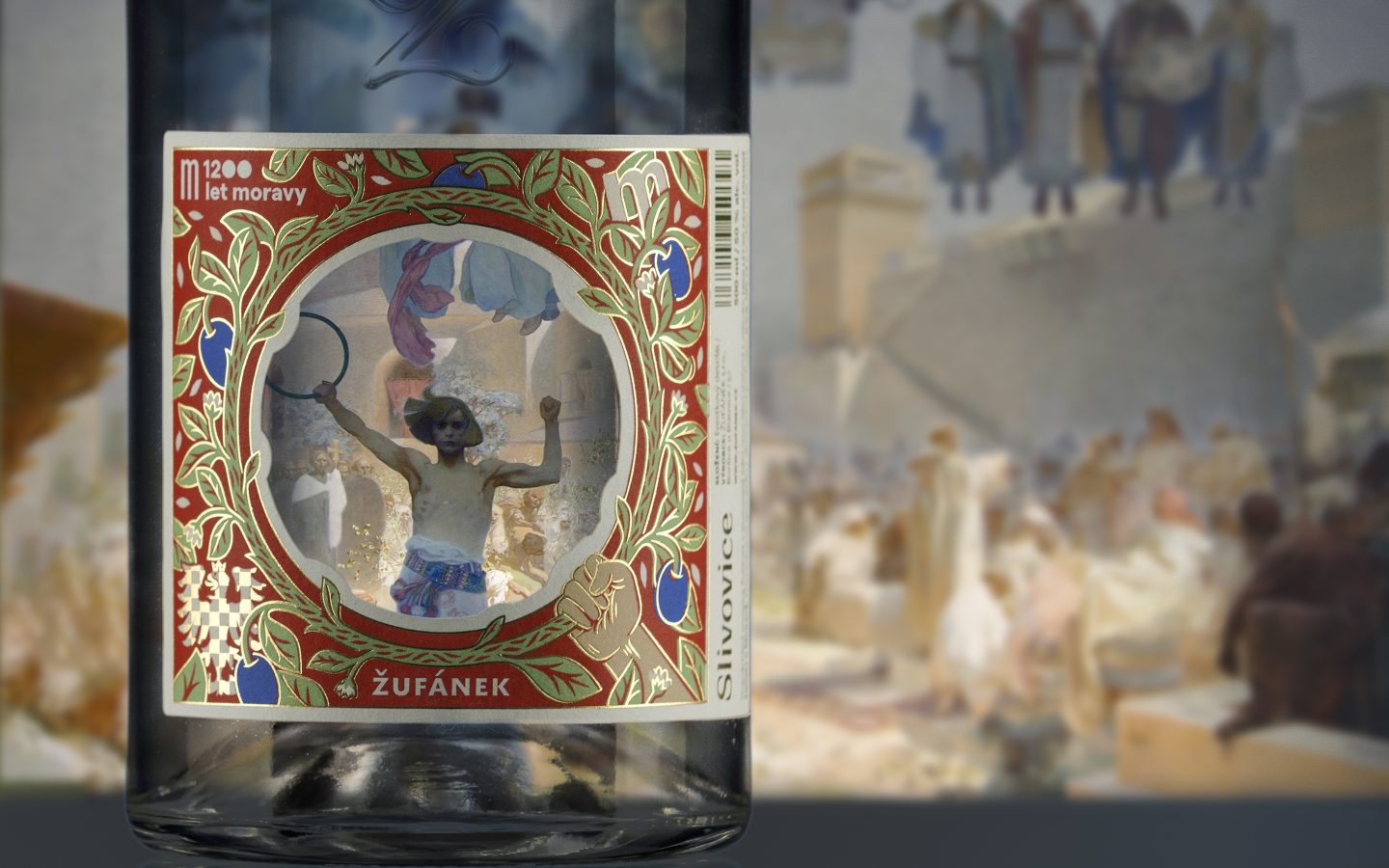
Among them, in the foreground, we see the figure of a zealous young man who is encouraging the Slavs. The circle he’s holding in his right hand represents Slavic unity.
And it was from this element that we derived our design.
Result
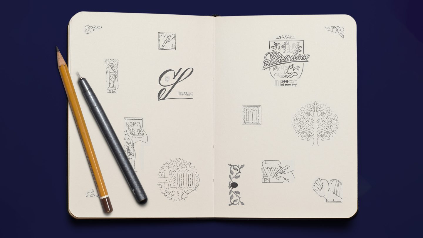
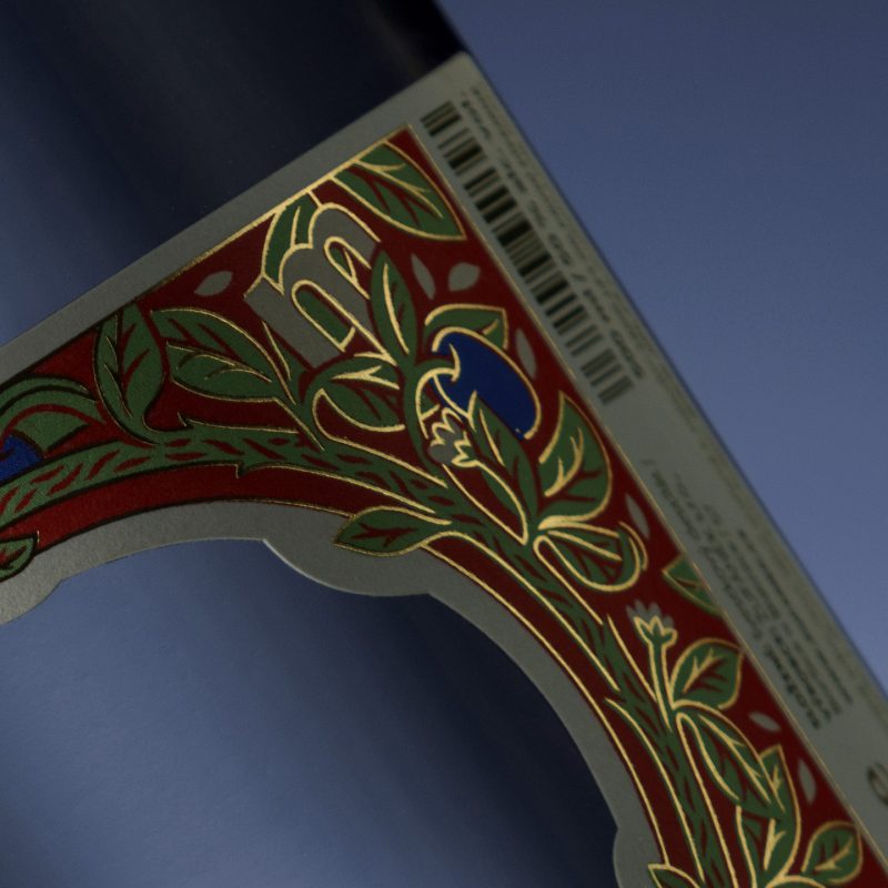
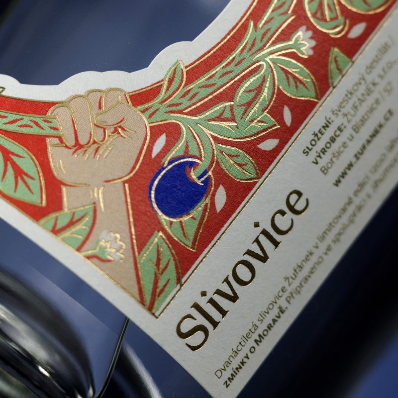
We distilled the strategic concept into a fresh take on traditional, Mucha-ish motifs. The central symbol of Moravian unity, the hoop – a circle – expresses continuity and the endless flow of time. This blurs the distinction between the Moravian past and the future (a strange side effect that often occurs when slivovitz is consumed…). Around its circumference, it is decorated with floral elements. These are a reference to illuminations and liturgy (and plum fruits as a less subtle reference to the product). The floral motifs are also elegantly embedded with other motifs that refer to the anniversary year and the heraldry of the South Moravian Region in the form of an eagle. The colours are blue, red and white, complete with festive gold referring to the anniversary and the limited edition of a premium plum brandy.
Through the hoop on the bottle, we can glimpse the 1,200 years of Moravian history. And if we look really closely (while sipping on the delicious slivovitz inside), we can also see its great future.
– Radek Dostal, Art Director
So, cheers, Moravia!
