Team
Strategy: Zuzana Behova, Jan Blazek
Creative Direction: Tomas Nedved
Art Direction: Radek Dostal
Graphic Design: Milan Nguyen
Typography: James Edmondson (OH no Type Co.)
Project Management (agency): Nikola Timkovicova
Project Management (client): Renata Sikorova, Lenka Sedlakova
Copywriting: Jan Blazek, Steven Kent
Website UX: Paweł Ratajczyk
Webdesign: Paweł Ratajczyk, Mateusz Słowakiewicz
Web Development: Dan Pohuba
Animation: Mateusz Słowakiewicz, Martina Kubalova
Director: Radim Vanous
DoP: Radim Vanous
Editor: Filip Hostynek
Sound Engineer: Jan Pololanik
Colour Grading: Filip Hostynek
Production: Nikola Timkovicova
Music: PONK
Photographer: Julius Filip, Zdenek Nemec


Brief
The Zlin Region is an administrative unit situated in the easternmost part of the Czech Republic. It’s inhabited by approximately 600,000 people, and offers a high standard of living and boasts a remarkable variety of natural and cultural heritage. Renowned for its advanced industries, its economic prosperity is linked to the dynamically growing Tomas Bata University, an institution bearing the eponymous name of the “Czech Henry Ford”. Tomas Bata (1876–1932) was a local businessman and thought-leader who became one of the world’s biggest multinational manufacturers and retailers of footwear of the 20th century. A true legend, Bata turned the humble village of Zlin into the region’s American-style capital and laid the foundation of Czech filmmaking, animation, design, and advertising.
Thirty years after the Velvet Revolution that marked the Czech transition to democracy, the region wasn’t living up to its expectations. Far from the capital, Prague, which soaks up the region’s precious talent, and with rather low salaries, the population had been steadily declining.
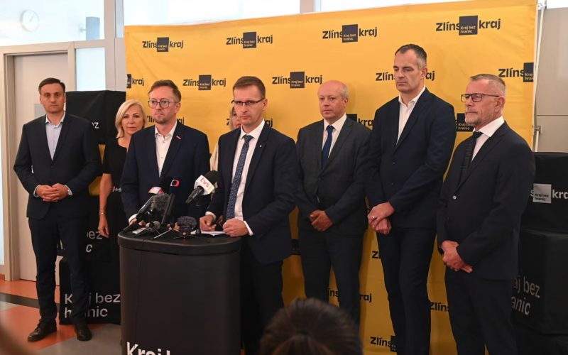
In 2021, the local government decided to rebrand the region to bring a new future to a place on the periphery.
The agency won this prestigious pitch and worked on this complex project on three levels: strategic, creative and executional.
Concept
The Zlin Region comprises parts of three traditional regions: Hanakia, Moravian Slovakia and Moravian Wallachia. With each region being completely different, finding one unifying element, a starting point for creating a new regional brand, was challenging.
But then we cracked it.
For decades, Zlin has been home to extraordinary people and companies in design, advertising, film, music, animation, and architecture. Driven by the power of ideas and human creativity, the region is the place where, in the words of Tomas Bata, “what you want, you can”. Oscar-winning musician Marketa Irglova, world-famous architect Eva Jiricna, or Vaclav Stanek, the founder of the fastest-growing shoe company in Central Europe, to name a few. These are inspiring visionaries who have overcome borders, both mental and geographical. New “Batas”, big or small, are there and will be instrumental in shaping the region’s bright future.
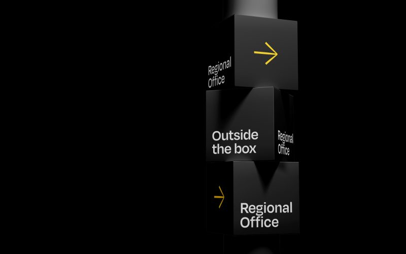
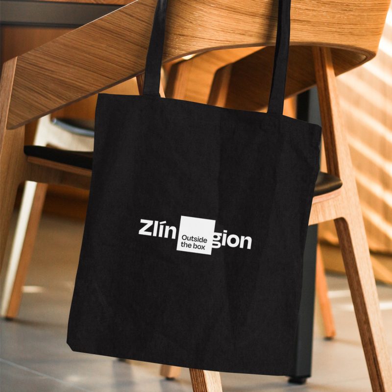
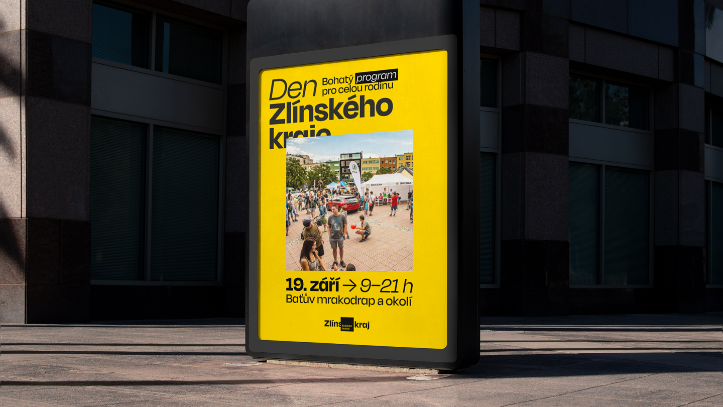
The agency encapsulated this insight in a brand essence “Live Creative Spirit” as the basis for the region’s long-term strategic branding. This transferred into a new slogan, “A Region Without Borders” in Czech – or “Outside the Box” in English transcreation. The slogan communicates the region’s unbridled creativity, stepping out of borders and stereotypes, openness to the world and the boldness needed to break through and grow. All this was transformed into a complex visual identity system to mirror the region’s new direction and support the fulfilment of its mission and vision. And yes, the visual style is rather out-of-the-box. As are the inhabitants of the Zlin Region.
“The Regional Governor has frequently mentioned his experience, especially with young people. He said none knew what the region and its government were and what they were for. Therefore, we sought to visually achieve with the logo a kind of “WTF” moment to surprise people and make them interpret what they see. The problem is, the logos of regions just kind of are – few people know what they look like, and even fewer people think about what they symbolise. We wanted to disrupt that.”
– Tomas Nedved, Creative Director
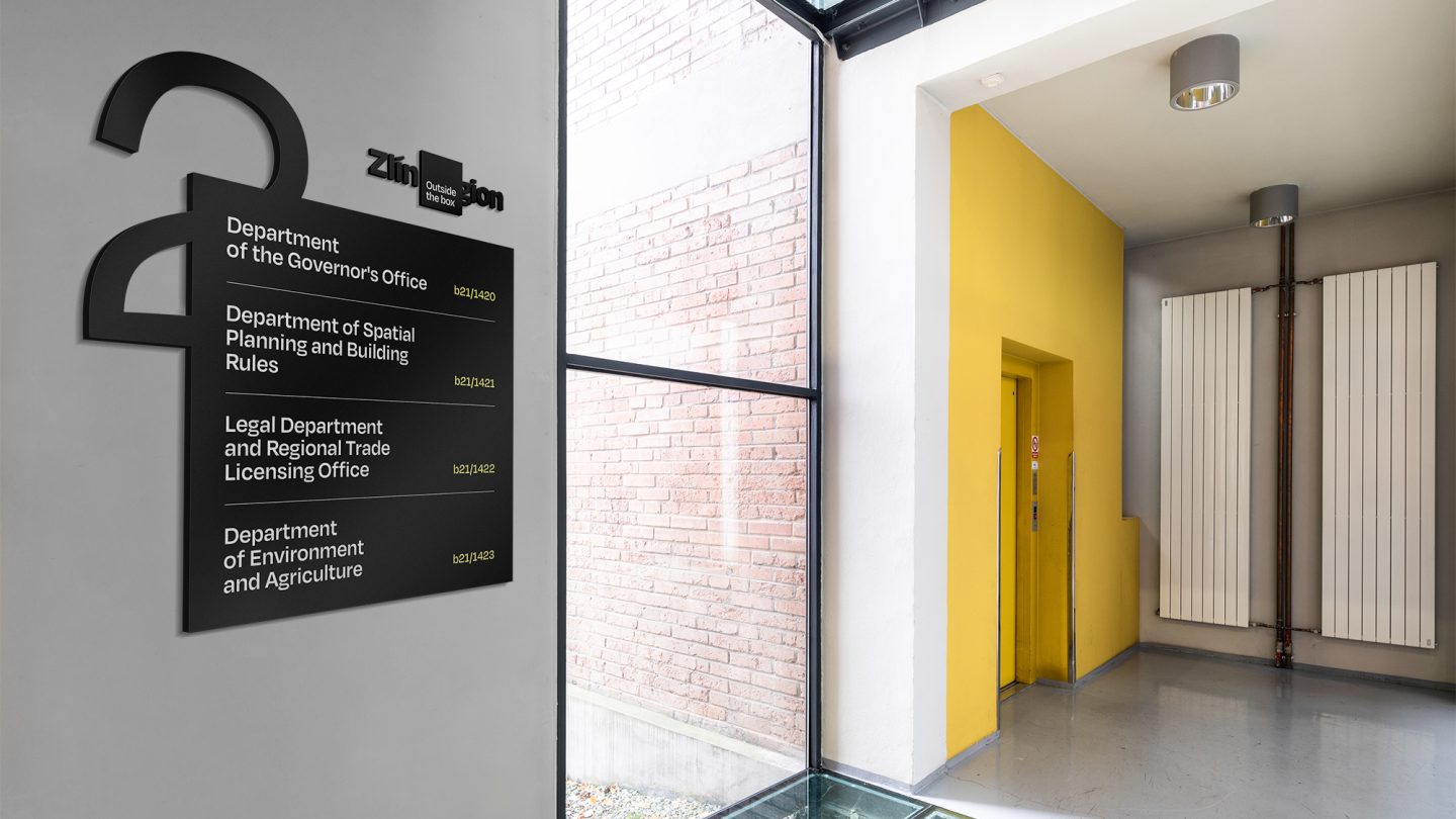
The logo semiotically represents “growing up” and “outgrowing”. On the one hand, it anchors and frames in the square everything that makes the region unique – a vibrant creative spirit, entrepreneurial DNA, courage, and worldliness. From this base, the region has grown and is growing.
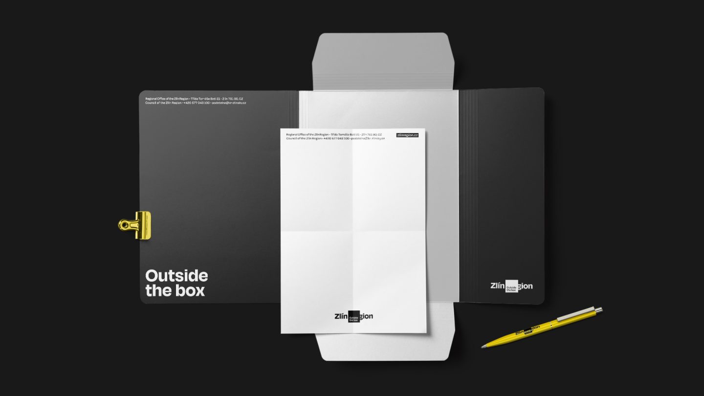
On the other hand, the square symbolises a small backyard closed off from the world, a comfort zone, or our own shadow. Or the proverbial “box” into which the Zlin Region is often placed in people’s minds as “that low-wage periphery in the east, far from Prague”. Through its new branding, the region is, however, outgrowing this stigma. Its natives and residents have been able to challenge established patterns, and succeed in crossing geographic and mental borders. Secondarily, the square is a shape typical for Zlin’s functionalist architecture, and its four corners symbolise the four historic districts. The new visual style works with four primary colours – black, white, dark yellow and light yellow. Yellow refers to the emblem of the Zlin Region. The font used was Degular.
“The role of a logo is not to decorate or please everyone by creating eye candy, which is impossible, especially in times of great diversity of opinion and the absence of a shared aesthetic canon. Its role is to communicate the brand clearly using strong visual abbreviations, symbols, etc. And if this approach made people in the region interpret the meaning of the region’s logo – what it means when we say that the region is ‘Outside the Box’, how this manifests in practice, what it means to me as a resident – or if it even inspired them, that would be mission accomplished.”
– Radek Dostal, Art Director
Result
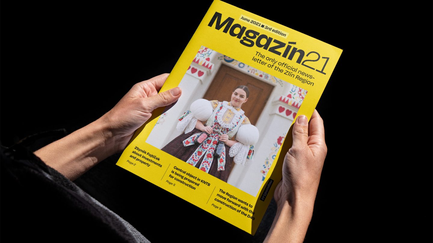
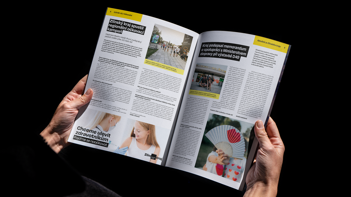
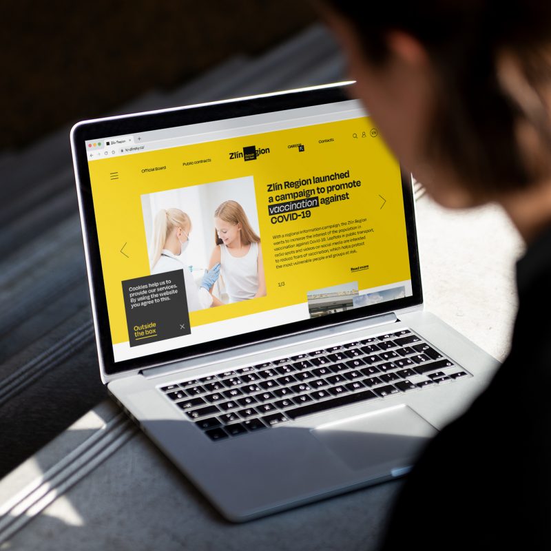
As part of introducing the new visual identity, we produced an explanatory video and a microsite that explained the change in detail to the general public. Because we were aware that visual identity could be controversial among people, we made sure that all aspects of it were properly clarified.
During the creation process, we also identified with the client the need for an image video. And because the Zlin Region is a “Region without Borders”, we travelled as far as Iceland to shoot with the region’s creative natives, architect Eva Jiricna and musician Marketa Irglova. Meanwhile, in the Czech Republic, we filmed with actress Eva Josefikova, showrunner Kazma and writer Alena Mornstajnova, to name a few “creative celebrities” who made it “outside the box”.
As of 2025, we continue to bring the region from the periphery back into the limelight. The “Live in Zlin” initiative, which we worked on with the local Technology Innovation Centre, aims to attract people outside the Zlin Region and convert them to residents.