Team
Strategy: Zuzana Behova
Creative Direction: Tomas Nedved
Art Direction: Milan Nguyen
Graphic Design: Denisa Novobilska
Typography: Displaay Type Foundry
Project Management (agency): Katerina Bednarikova
Project Management (client): Lucie Psurna, Michal Janecka
Challenge
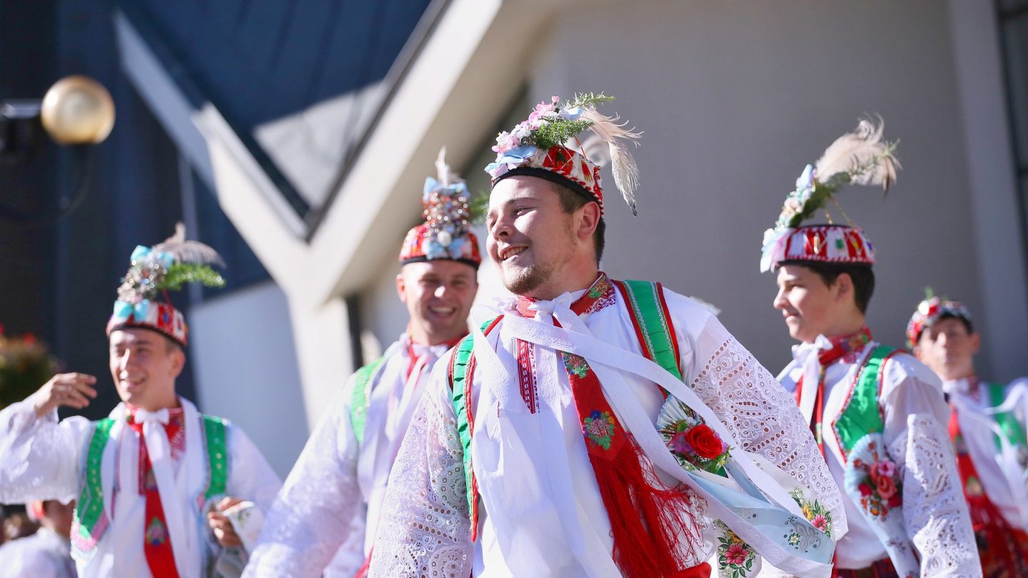
Local authorities wanted to transform Uhersky Ostroh, in the Moravian Slovakia region of the Czech Republic. They perceived consistent branding in all communication channels and touchpoints as crucial to kick-start the historic town’s future development. In their brief, they explicitly said they wanted new ideas for the brand, going beyond references to folklore or wine. These elements are commonly associated with Moravian Slovakia, which borders Slovakia and Austria, and is also known for its characteristic music, costumes and traditions. They also wanted new visual concepts rather than relying on the existing coat-of-arms, flag, or colours.
Having won a pitch, the agency had to come up with a fresh solution.
Concept
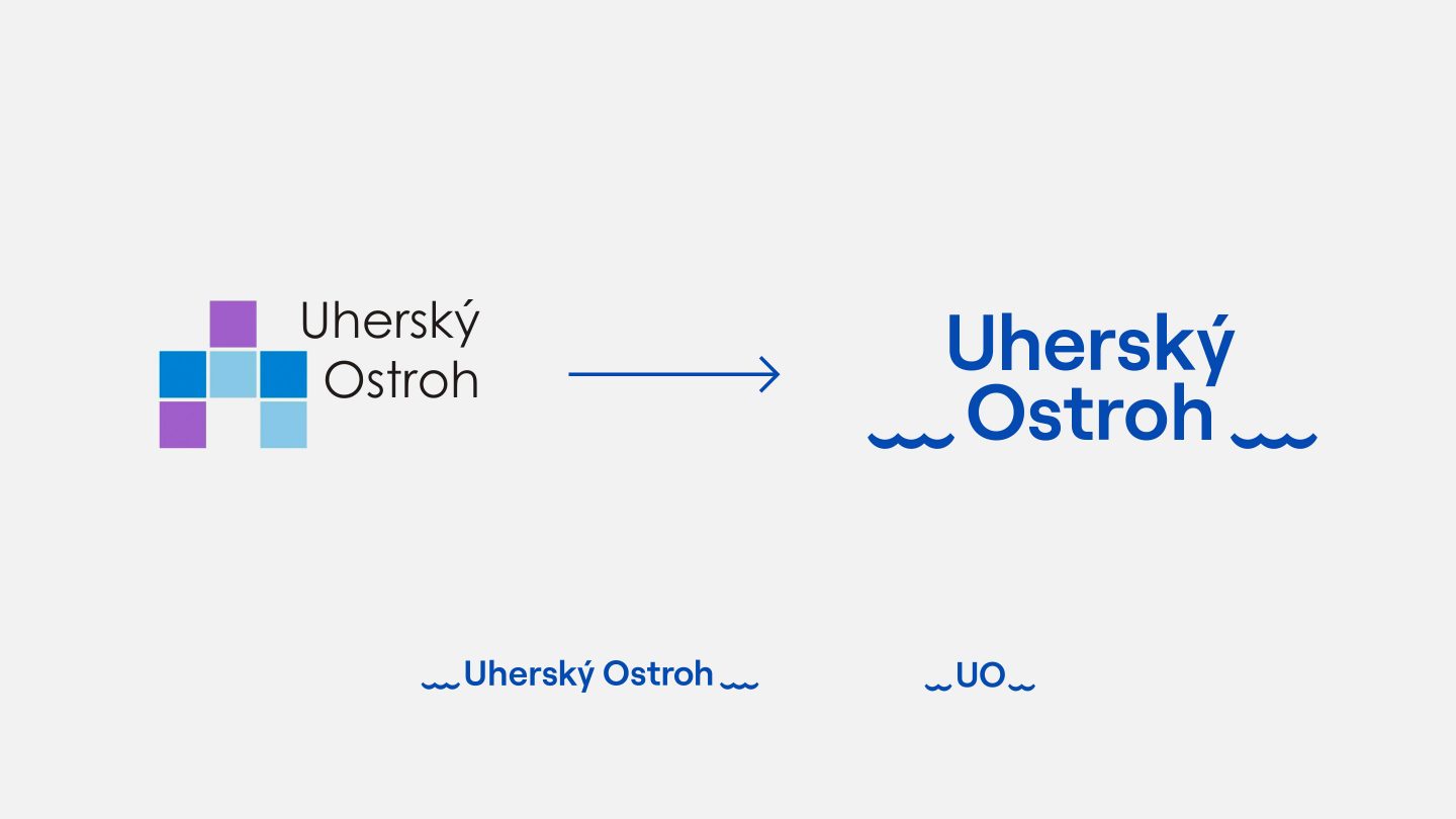
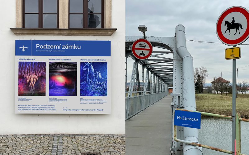
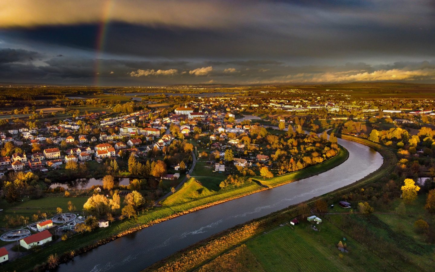
Uhersky Ostroh lies on both banks of Morava, a tributary of the Danube and the main river of Moravia. The name of the town Ostroh (also historically spelt Ostrov – or Island in English) is derived from the town’s island-ish location.
The water element in the town is literally omnipresent. The town centre is surrounded on three sides, making it almost an island, and the town representatives even built a lighthouse in honour of water. The town is also a dock on the Bata Canal. This is a navigable canal on the Morava river, built during 1934-38, and today used mainly for recreational cruises.
“The water element determines the city’s overall character and, hence, was the critical fundament on which we built a new visual identity.”
– Milan Nguyen, Art Director
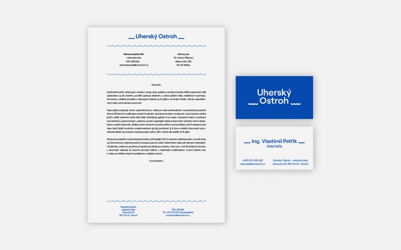
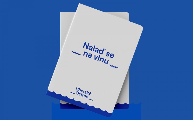
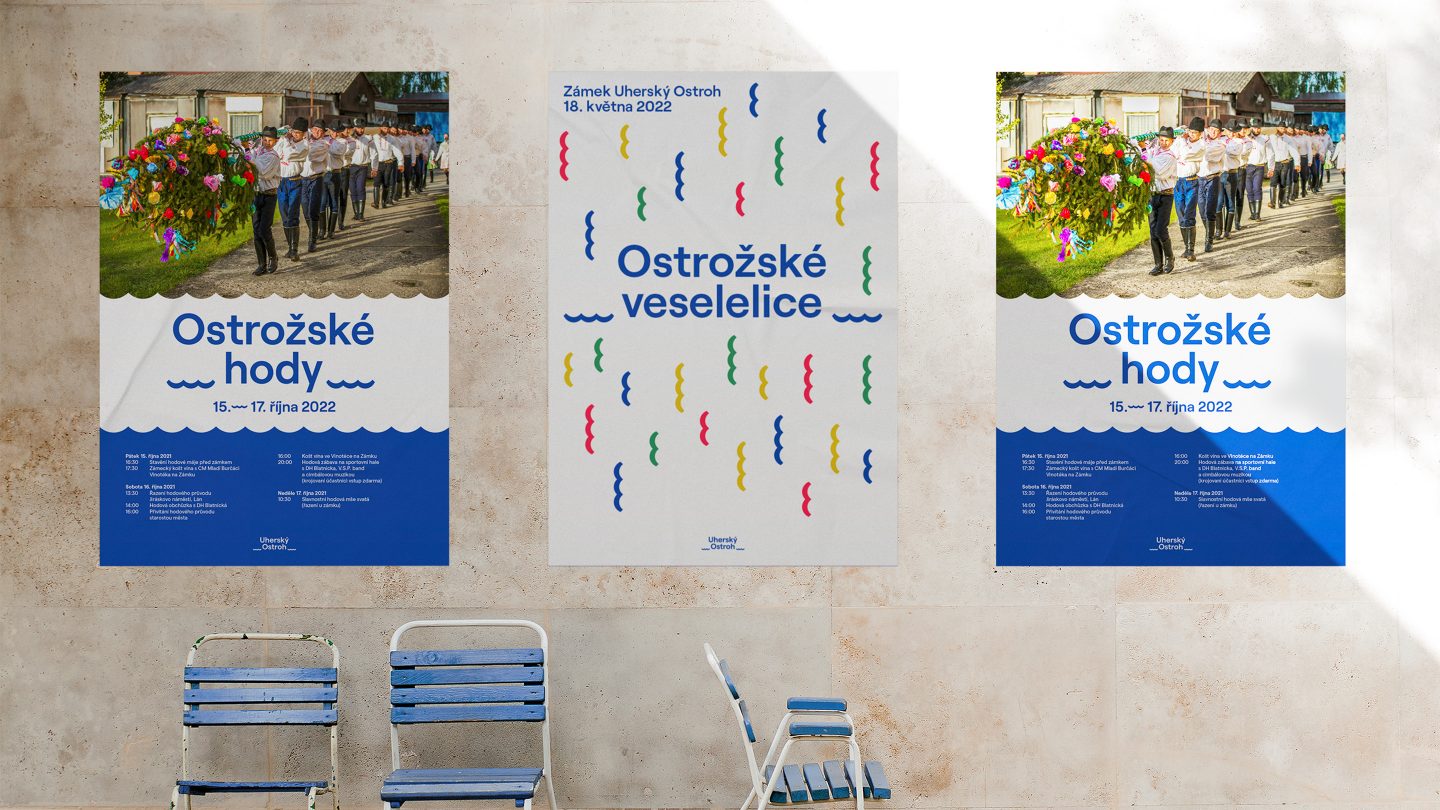
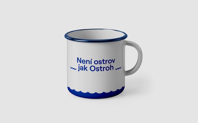
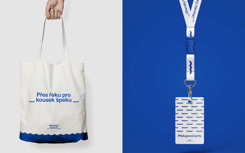
We worked with the Morava River as the central motif in our design. The subtle but still distinctive graphic element of waves surrounds the name of the town itself. The logo has a central composition, with the text referring to the island (or Ostroh in Czech) as something that has always, and permanently, protruded above the water, creating waves.
The logo is playful, inviting, and easily applicable across all types of design and communication outputs.
We also designed a complementary visual element by multiplying the motif of waves to create a lovely pattern.
Result
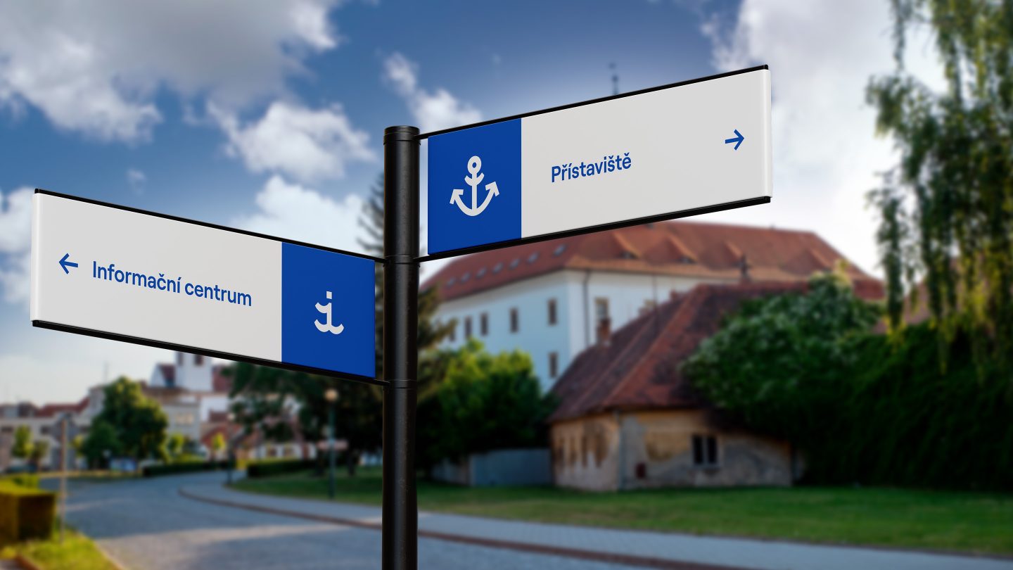
The new visual identity shows that even a tiny town (with about 4,300 inhabitants) can approach the issue of its design and communication responsibly and with the utmost care and professionalism. The identity was codified in the form of a design manual. The 49-page document covered all facets of branding. These included the logotype, typeface, city symbol, administrative and merchandising stationery, multimedia applications, presentation and gift items, interior wayfinding system, and the city’s wayfinding system.