Team
Strategy: Zuzana Behova
Creative Direction: Tomas Nedved
Art Direction: Pawel Ratajczyk, Mateusz Slowakiewicz
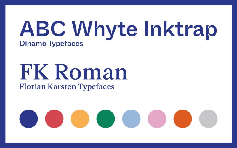
Typography: Kvetoslav Bartos (Florian Karsten Typefaces) & Dinamo Typefaces
Project Management (agency): Zuzana Behova
Project Management (client): Aneta Hubacova (Czechdesign)
Challenge
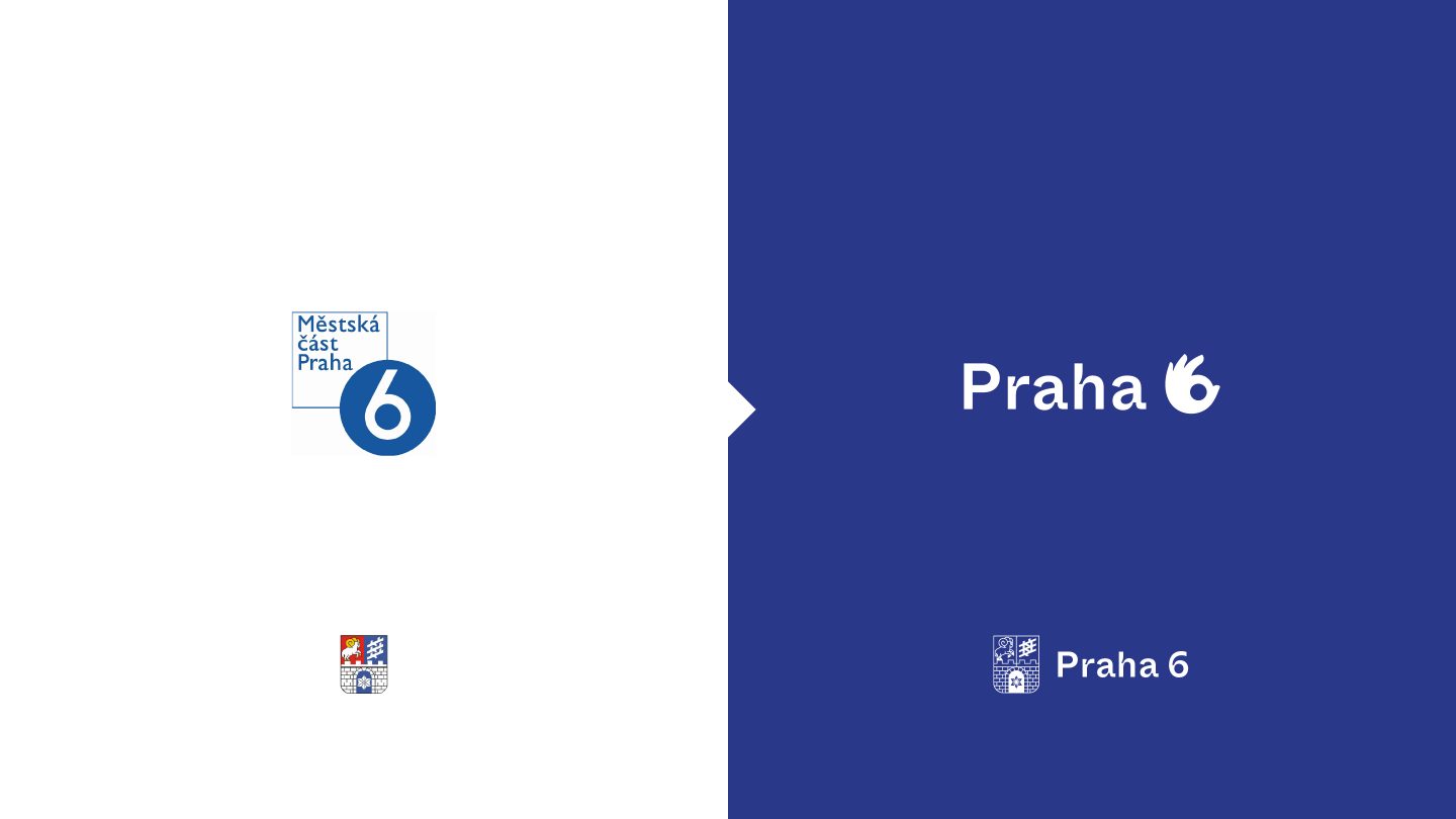
The agency was invited to pitch a new visual identity for the municipal district Prague 6.
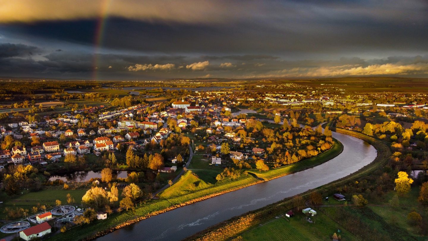
With more than 100.000 inhabitants, the district is unique in many ways — its high standard of living and education, the abundance of parks and green spaces near the city centre, and its richness in leisure activities. With a diverse international community, it’s one of the most attractive parts of Prague, with a peaceful and pleasant atmosphere (but with a lively nightlife, too).
According to the client, the identity should be confident and bold but simultaneously honour the pride and traditional values that emanate from their citizens and are reflected in the district’s character.
Concept
A district is like any other brand. The relationship between the district and its brand is shaped by the authentic experiences of local residents. Therefore, the district’s visual identity must express its character in a way that resonates with and engages people. This is especially important for the development of the place and the relationship between the district and its brand.
The challenge we faced was to define the character of Prague 6, a district the size of a big city. Despite the richness and variety of the place, we focused on the “place where it is good to live” aspect. This is because, despite a sense of grandeur and sophistication in Prague 6, with its embassies, villas, and elite places, it has an inclusive community spirit for both “regular” folk and visitors, resulting in a very high quality of life.
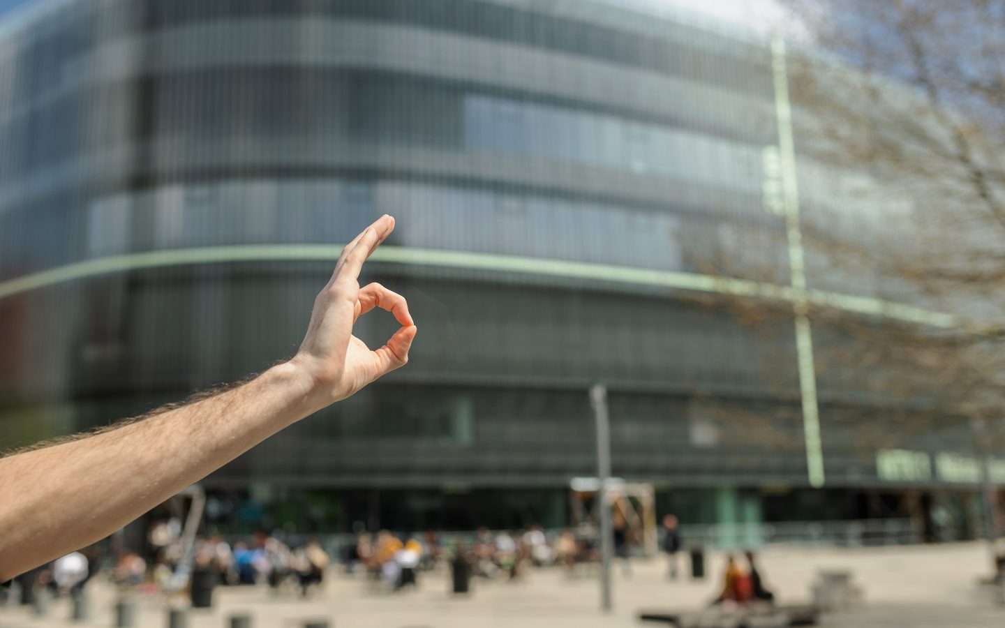
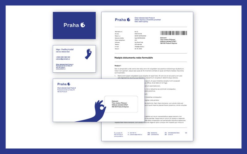
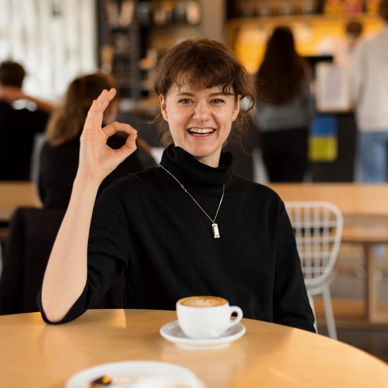
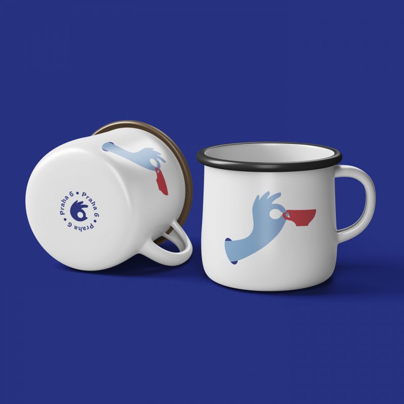
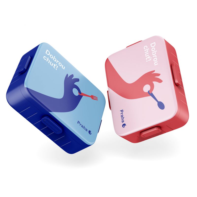
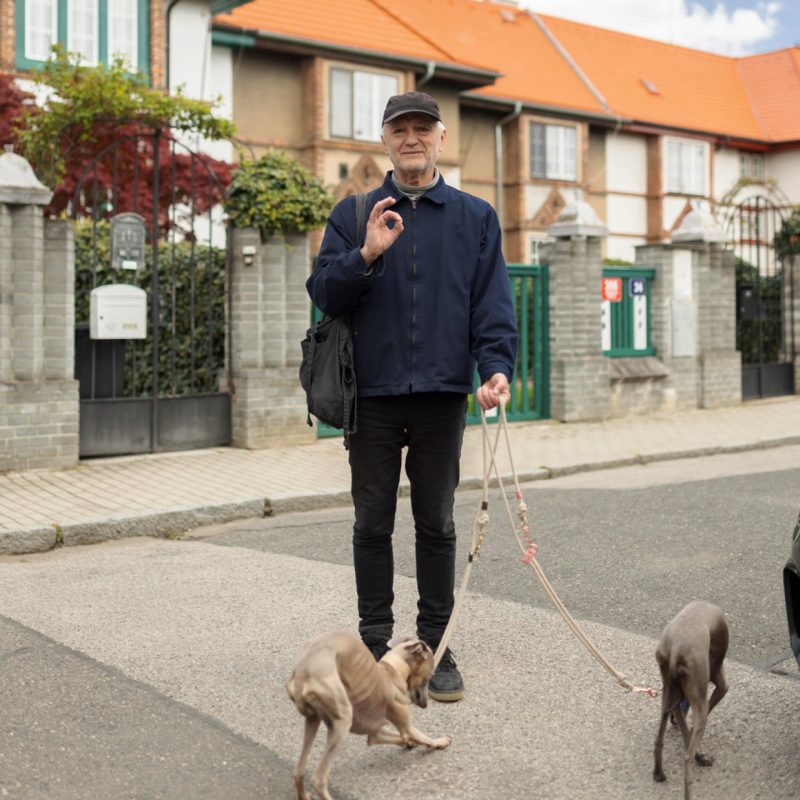
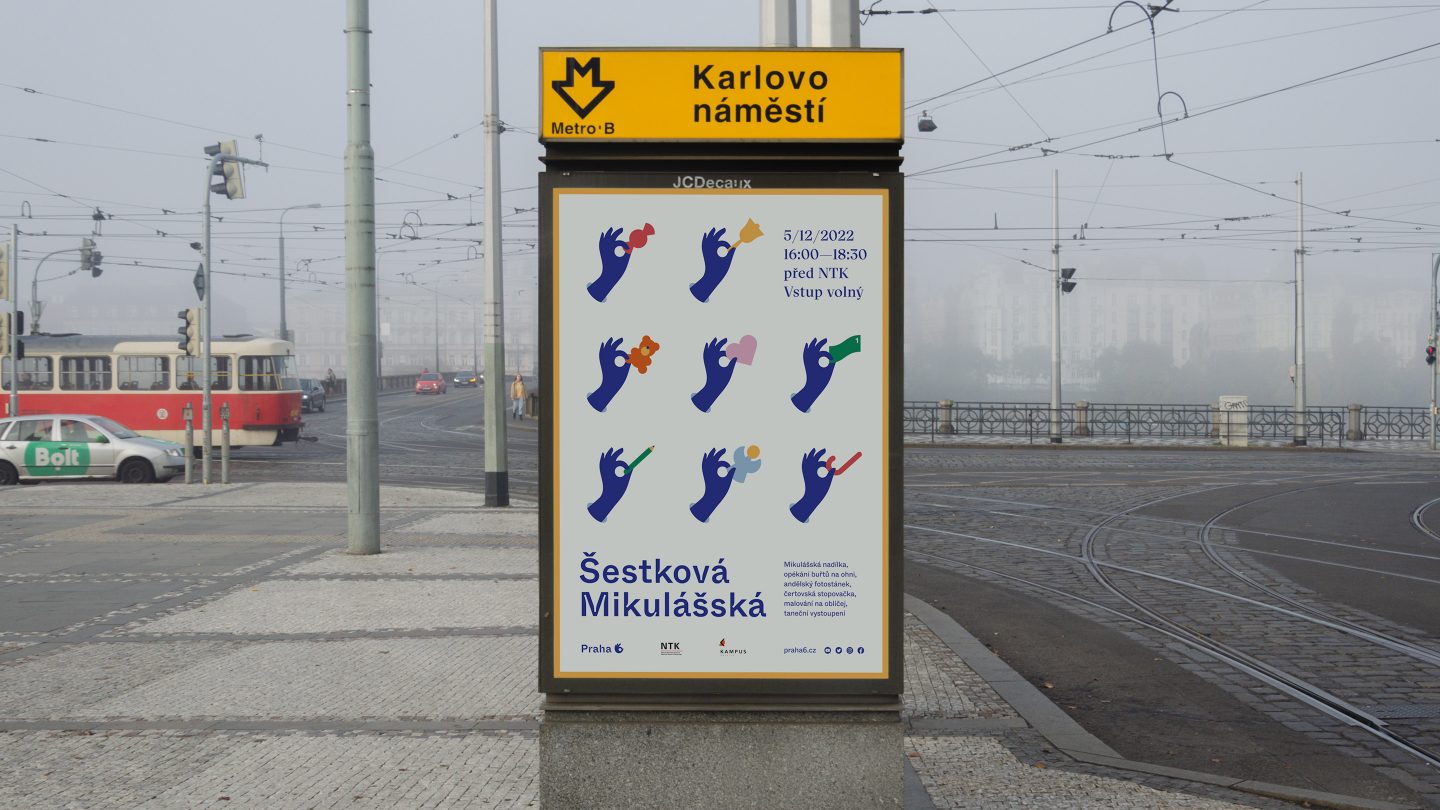
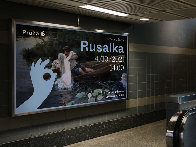
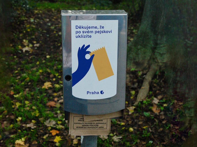
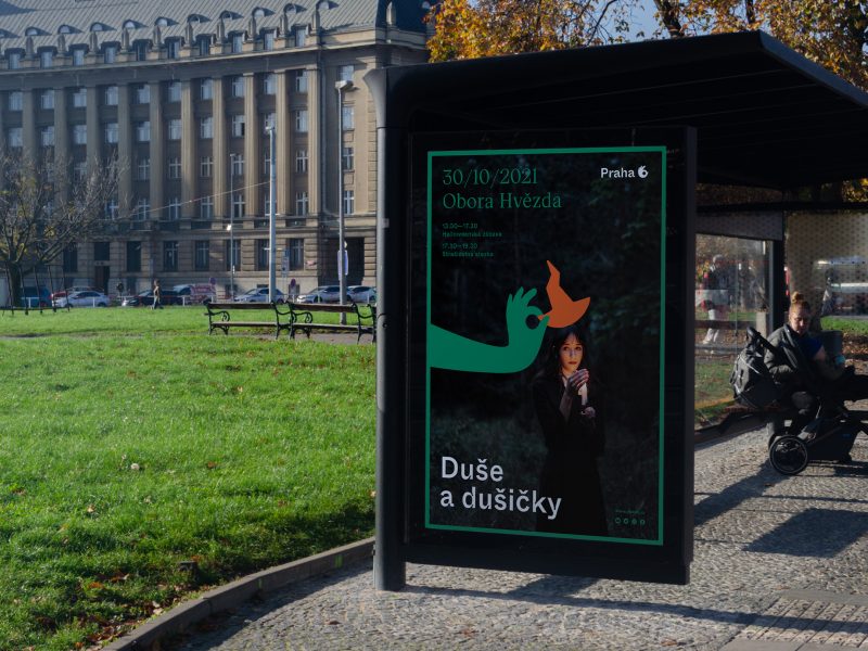
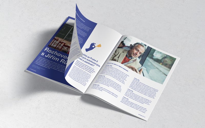
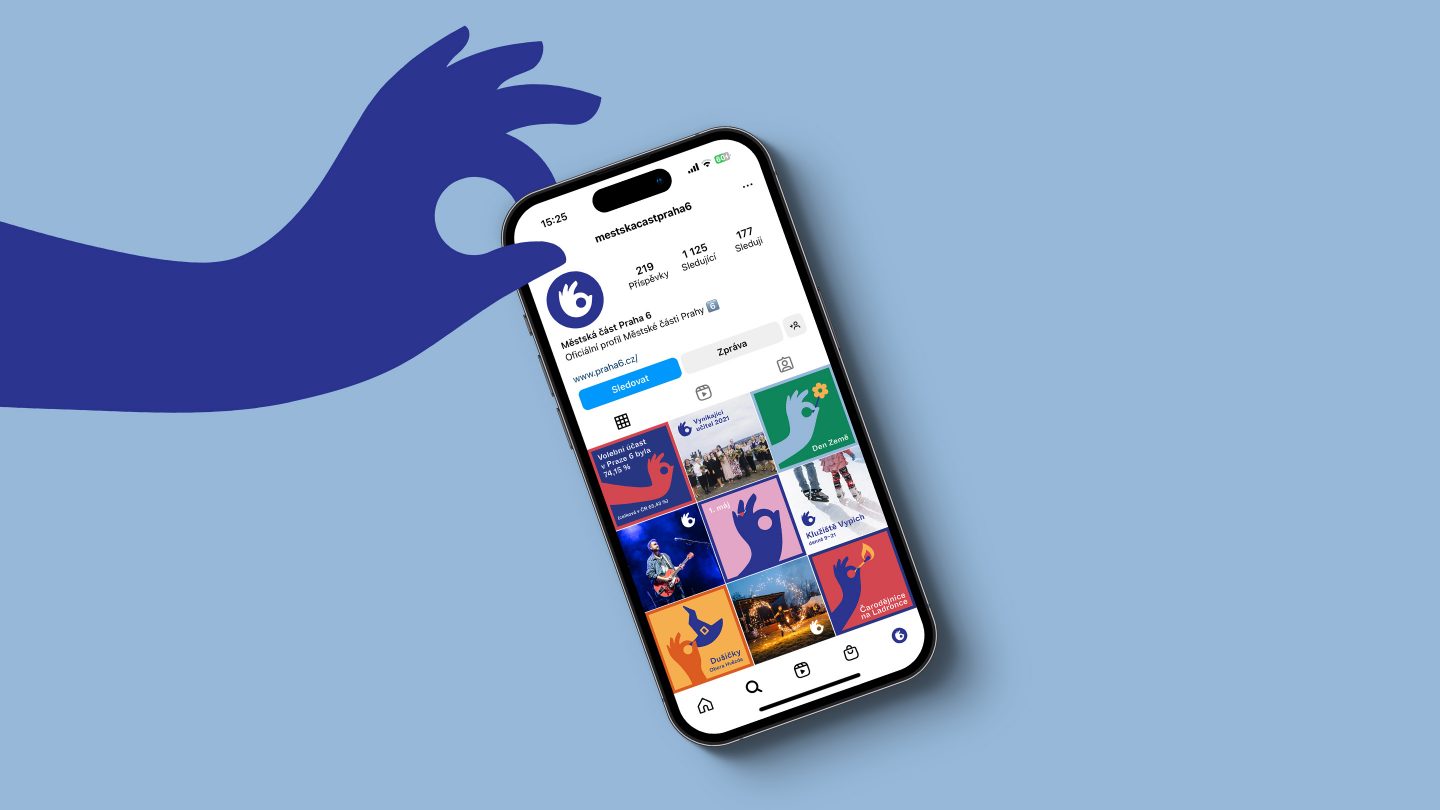
The cornerstone of the visual identity was a simple, universally recognisable gesture — a six formed by the thumb and index finger. This symbol represents both “excellent” (place to live) and (Prague) “six”. We were pleased to see how the visual identity was universal in terms of rolling out the concept in various visual outputs. These ranged from fully illustrated pictures for kids or family-oriented events to official announcements through which the city management communicates with the community.
Result
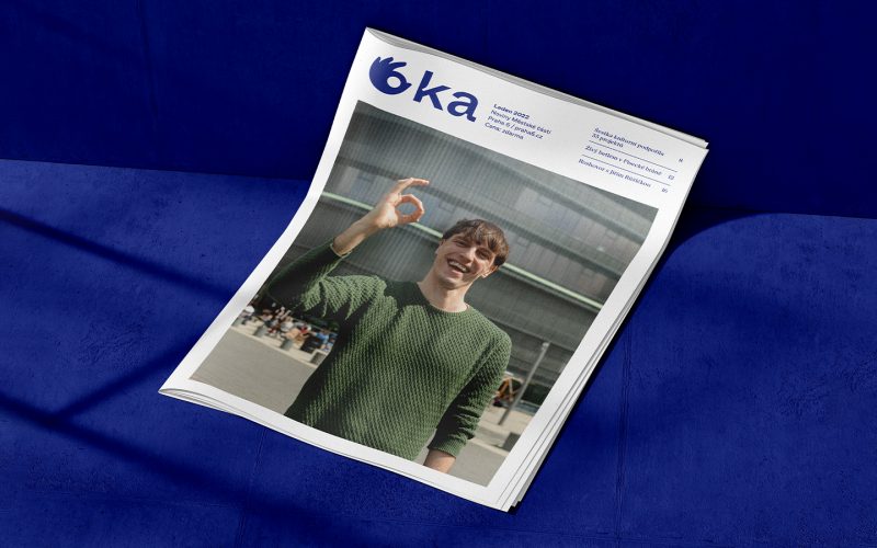
The jury appreciated the emotional charge of the design, which made it stand out from the others. They noted that the agency found a very original and positive symbol, which they considered fresh and memorable. The colour scheme was also positively evaluated as it enhanced the pleasant feeling of the design. Additionally, the jury appreciated the practical and lightweight layout of the town hall newspaper.
More than 75 designs participated in the pitch. Our work ended up placing second — but we still love it and consider it one of our most noteworthy designs of 2022.
After all, you be the judge.
