Deliverables
Conceptualisation
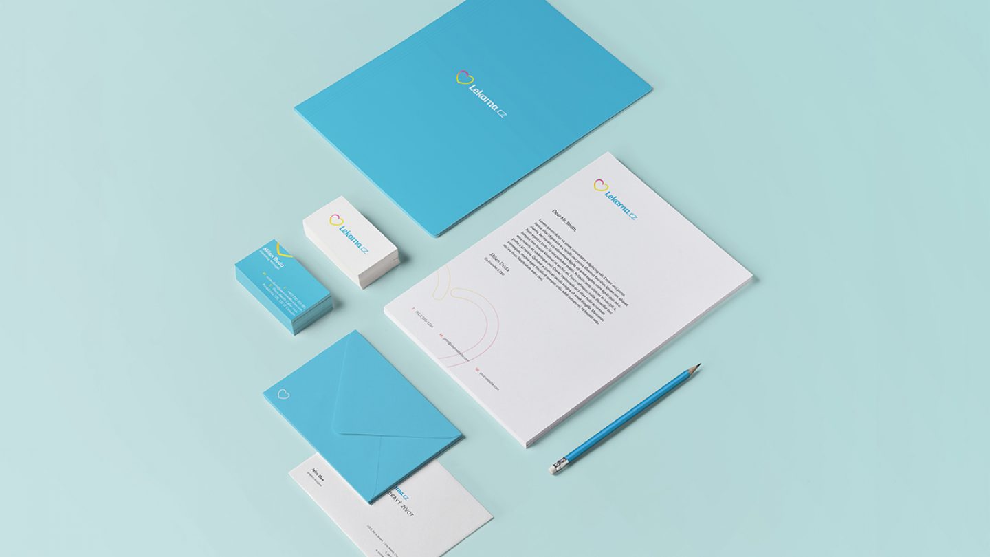
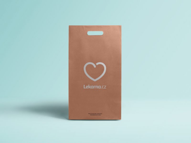
Corporate design
Web design
Brief
Produce a new visual identity, encapsulating the brand essence: “The place where they love me”.
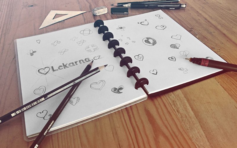
Action
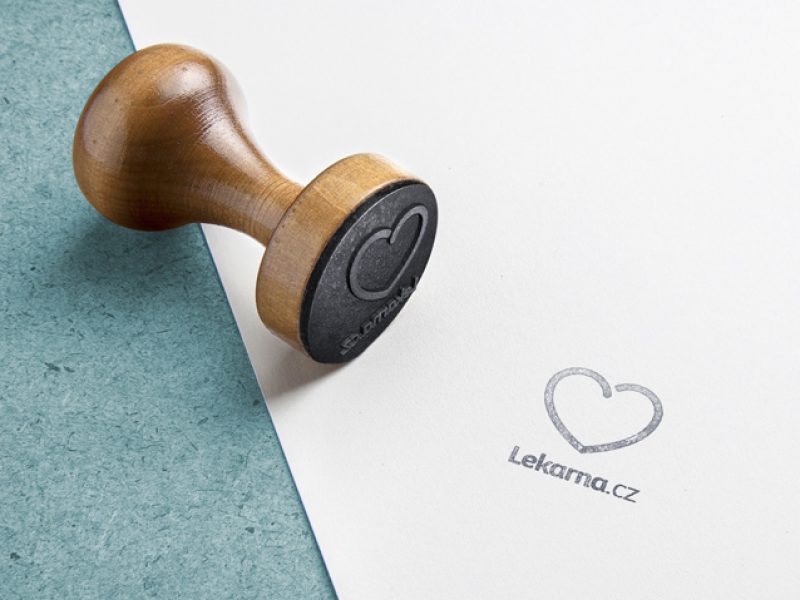
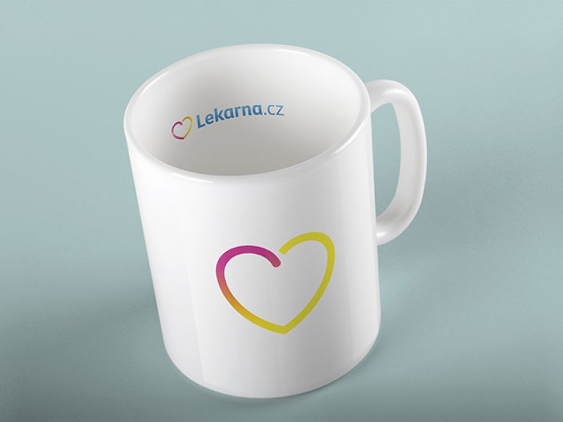
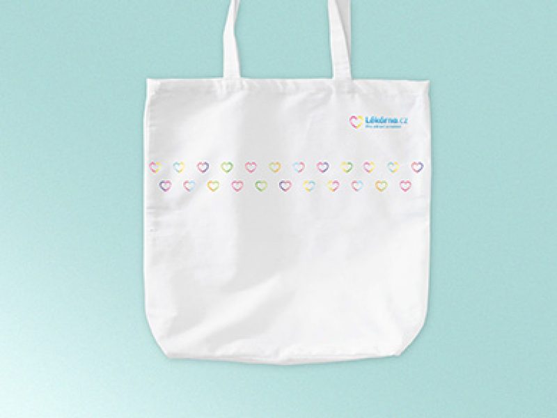
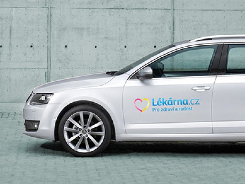
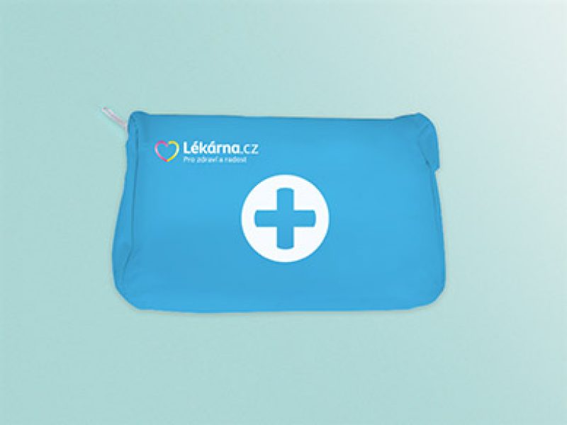
We chose one of the world’s most recognised and popular pictograms — the heart. Unlike more common symbols such as mortar and pestle, tablet, or pharmaceutical cross, we feel the heart stands out as fresh, straightforward, and easily understood. Alongside the concept of love we highlighted its associated meanings, including health, family, care and joy. We did this using modern typography, simple iconography and warm, positive colours. The client must have liked our concept, because our little-but-great team won the account!
Result
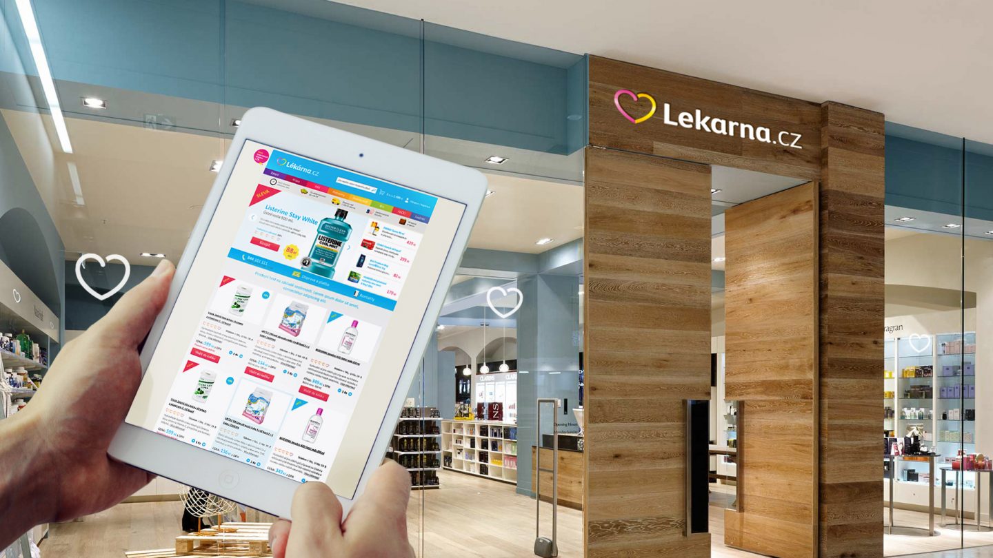
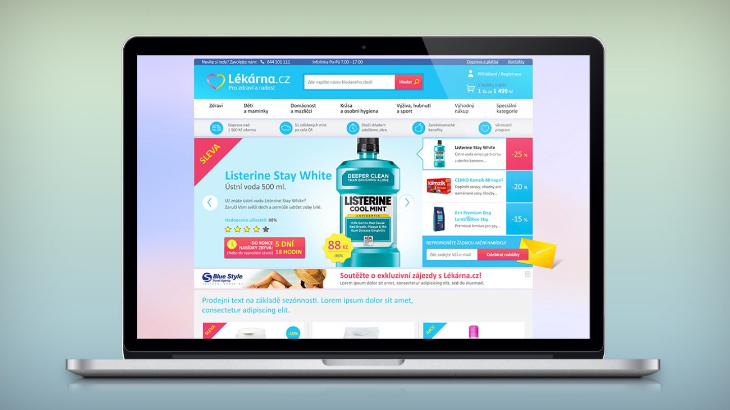
As of January 2015 the new identity is being implemented across all different channels. We also got involved in creating the homepage of the new site. Here’s our approach to both parts.