Team
Strategy: Jan Blazek
Creative Direction: Tom Nedved
Art Direction: Marcin Szewczyk
Challenge
ZRIA was evolving from an organisation primarily associated with the Holešov Strategic Industrial Zone into a broader regional development agency — attracting investment, talent and innovation, connecting the Zlín Region with the world and creating opportunities for people to live locally while working and thinking globally. The project also grew naturally out of our long-term cooperation with the Zlín Region and the extensive body of work we had already created together. This brought a particular design challenge: ZRIA needed a distinctive identity of its own, while remaining recognisably connected to the Region’s existing visual language. Not a clone, but a conversation.
Concept
We built the identity around a simple idea: moving forward and upward. The new ZRIA symbol draws on the geometry of the Zlín Region identity, but transforms it through an upward-moving arrow — expressing progress, ambition and opportunity. The arrow then breaks free from the logo to become a graphic device in its own right, creating a visual language that is related to the Region yet unmistakably ZRIA. We developed the idea into a flexible brand architecture spanning ZRIA, Holešov Industrial Zone and Future by ZRIA, complemented by a distinctive colour palette, typography and the empowering line Whatever you want, you can, inspired by the optimistic, can-do philosophy of Zlín’s most influential entrepreneur, Tomáš Baťa.
Result
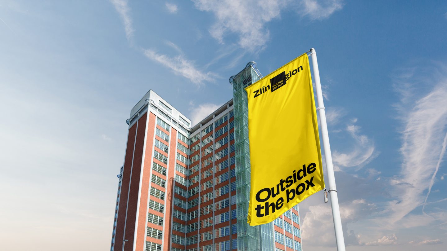
The result is a coherent and scalable identity that gives ZRIA a distinctive presence of its own while retaining a clear relationship with the Zlín Region. Rolled out across digital and print communication, presentations, events, merchandise, signage, wayfinding and buildings, the system provides a unified platform for ZRIA’s increasingly diverse activities — from investment and regional development to innovation, international cooperation and talent attraction.