Deliverables
Conceptualisation
Art Direction
Graphic Design
Packaging
Multimedia (Photo & Video)
Web (design & build)
Social Media (content & campaign)


Brief
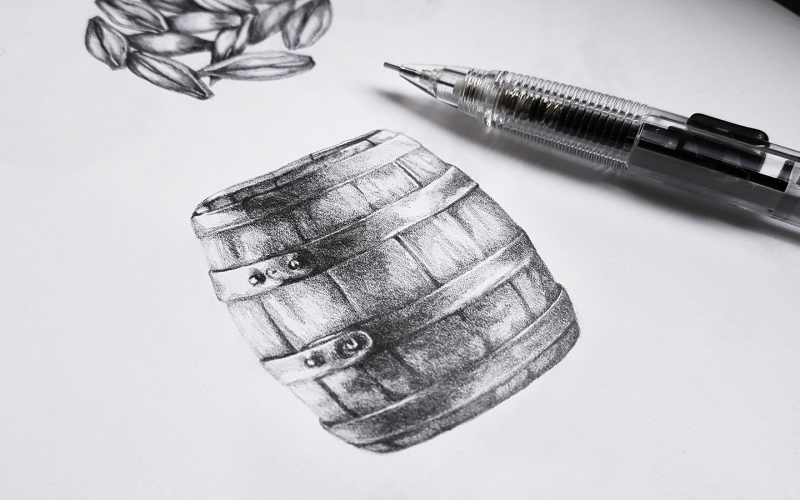
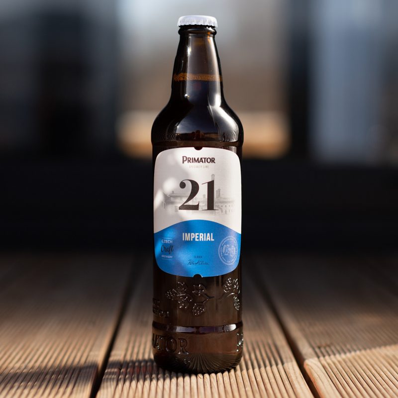
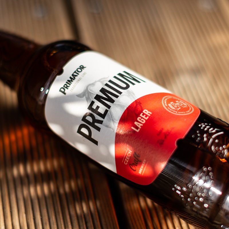
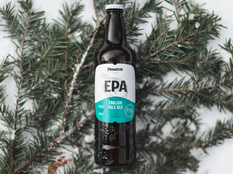
Creating the greatest beer means focusing on the smallest details. And those details are what distinguish craft brewing from mass production. Its image as a precision, detail-oriented craft is shown in our design for the label and new logo.
Action
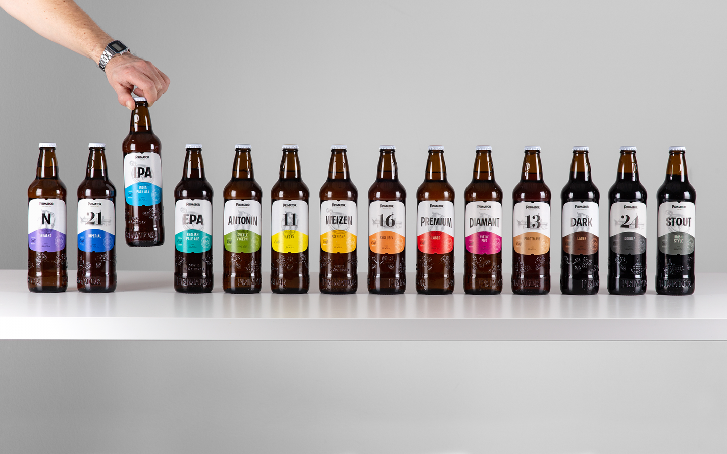
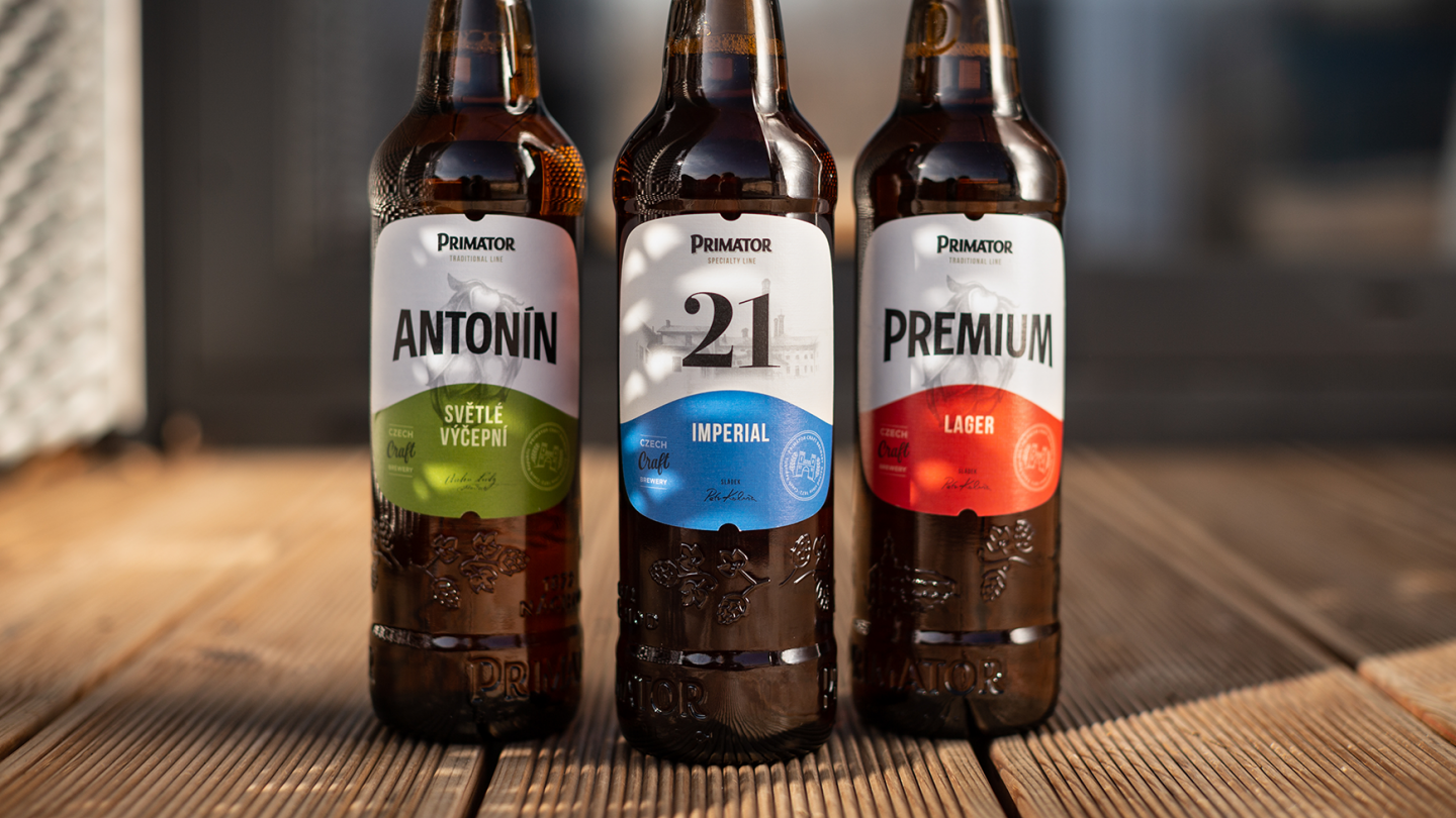
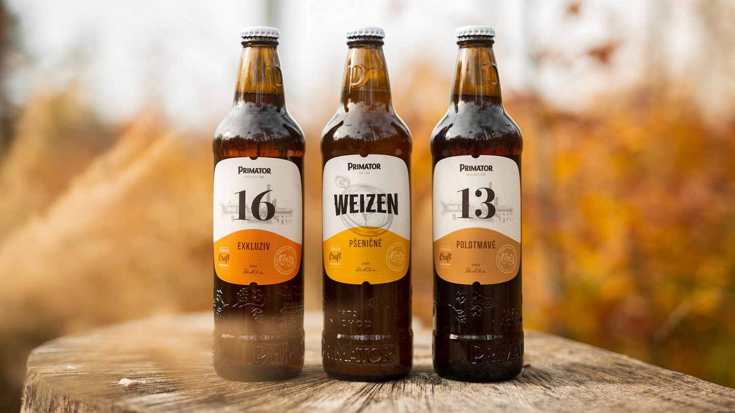
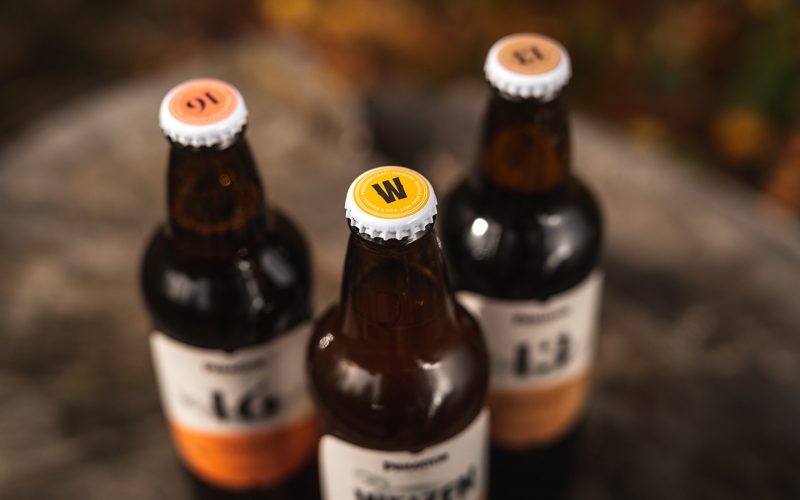
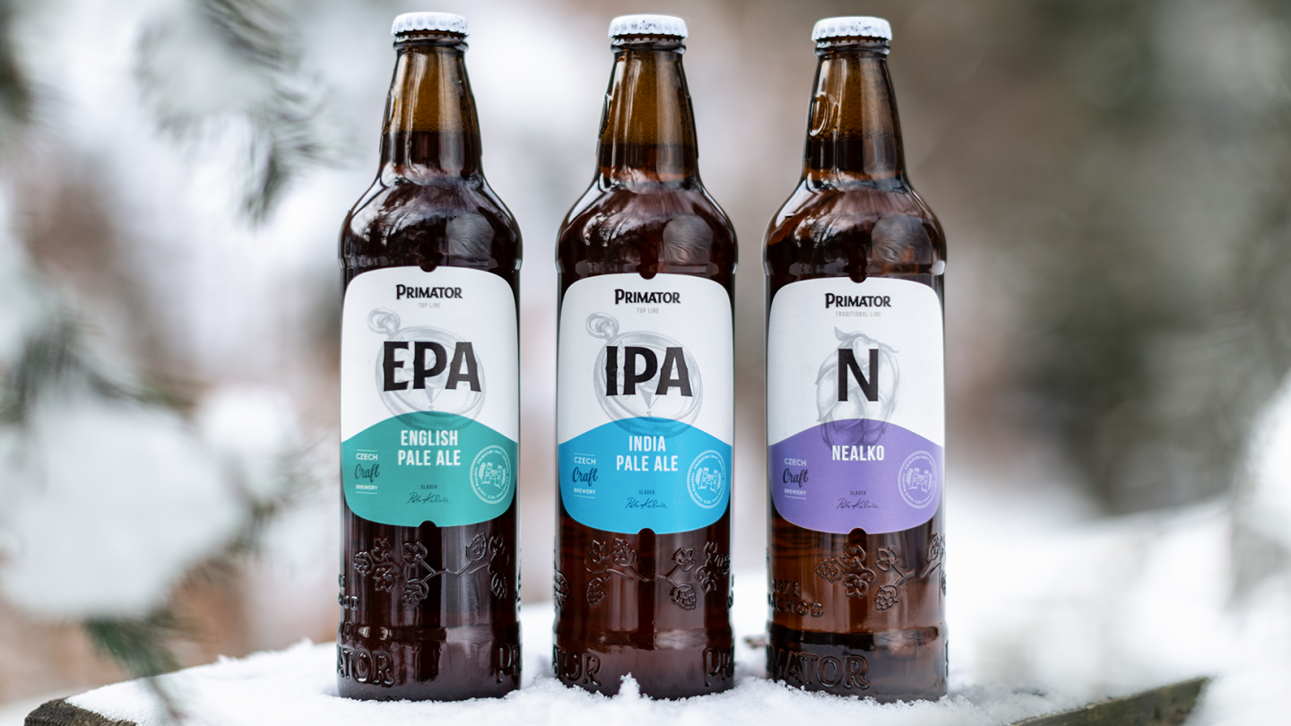
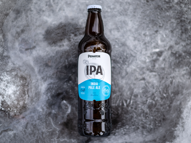
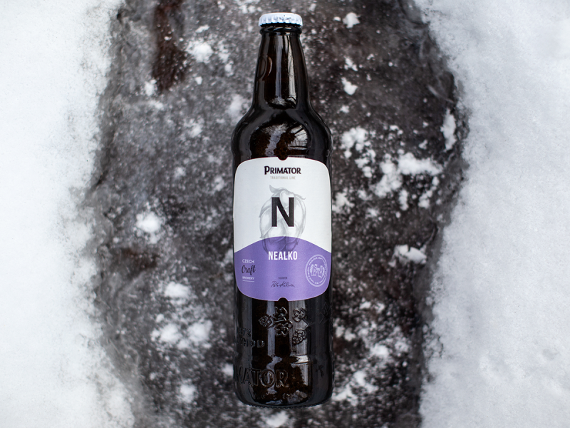
We prepared two label versions. We abandoned the clichés — overused elements such as the Art Nouveau ribbons. For one thing, the various product lines differ by font, pattern, shade, colour and geometric elements, paper type and print refinement.
Secondly, we reflected more on the traditional Czech approach to designer beer. With an emphasis on craft look and feel, we have given the beer a personal, authentic character more often found in small family-owned breweries.
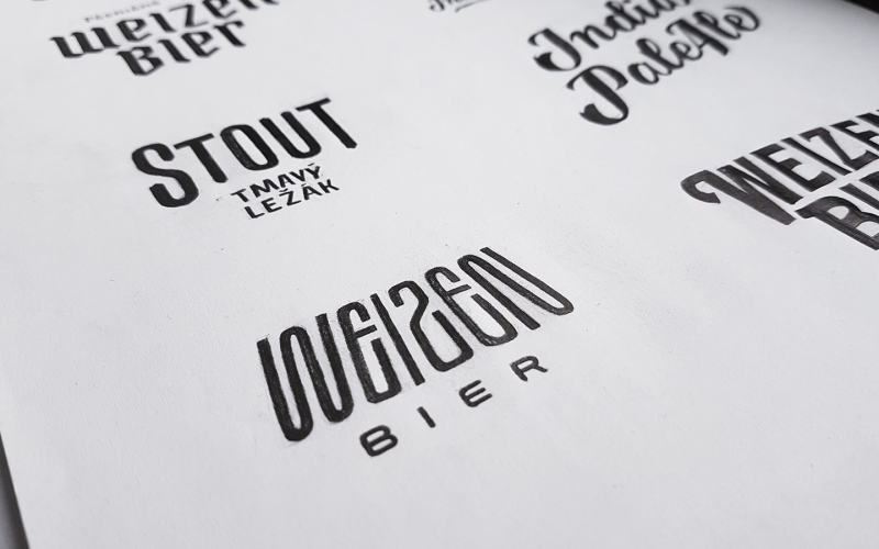
The brewery’s logo has also been simplified. Removing the frame and coloured shadow links the logo better to the label. However, it is still the label’s most important, visible element. The brewery’s location shows a simplified symbol of a castle from the flag and crest of the town of Náchod.
Result
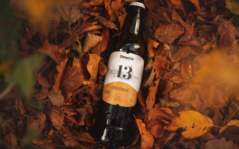
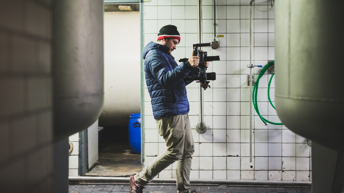
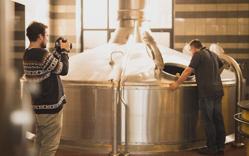
Primátor beer’s new packaging has a modern look based on simplicity. The design has received several international awards, incl. European Design Award and the Red Dot Award. In addition to graphic design and packaging, our collaboration with this client also entailed multimedia (photo & award-winning video The Real Craft), web (design & build), and social media (content & campaign)
