Deliverables
Conceptualisation
Art Direction
Graphic Design
Brief
The Czech Museum of National Literature was transitioning into a new era. The institution was going to open to the public for the first time, in the form of a bricks-and-mortar museum of literature. With a EUR 43k budget, the client organised a pitch to develop a visual and brand identity – and we were one of the four agencies invited by CZECHDESIGN to pitch.
Action
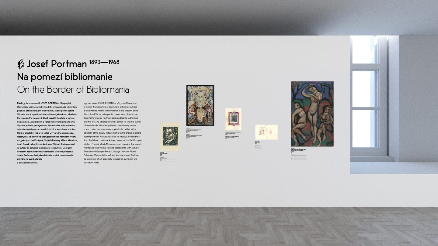
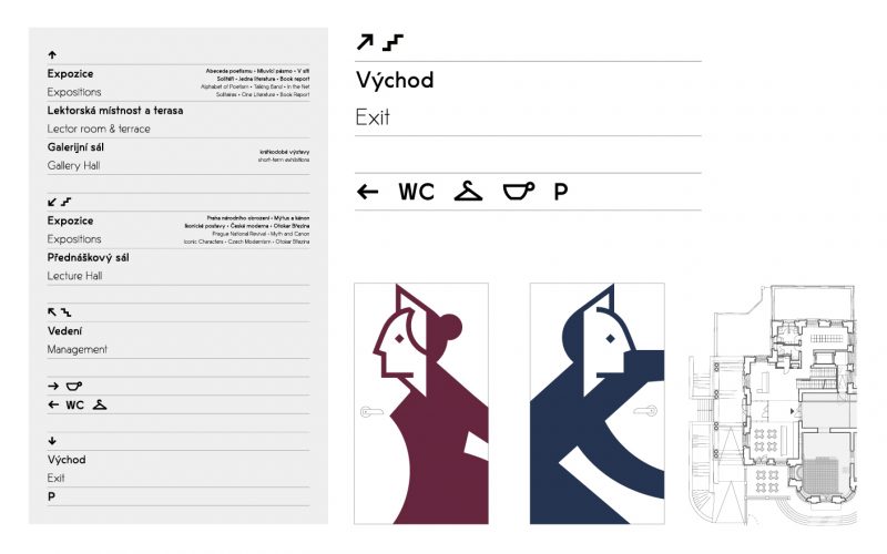
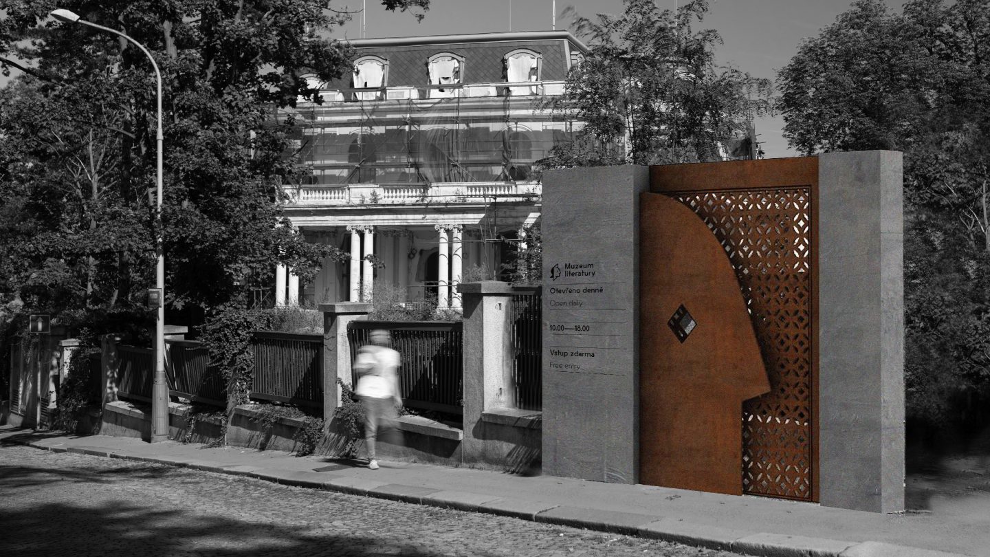
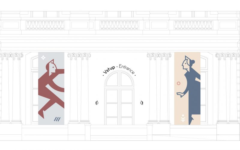
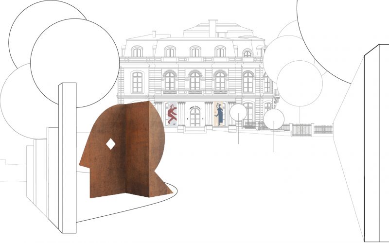
Our visual identity’s key element, the logo, consisted of two components. Textual and graphical. The symbol was formed by a head pressing through a sheet of paper. This subtle reference to literature could be interpreted on two intertwining levels:
1) A reference to a writer Their personal “imprint” in their work, their worldview, and their innermost perception of the topic they process.
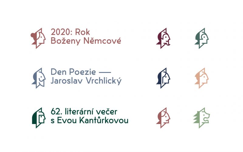
2) A reference to a reader Someone who delves into the author’s work, and in doing so, transitions from the real world to the imaginative world of literature. In addition to its default general version, our aim was for the client to work with the head symbol as needed, adapt it and put it into different contexts. Just like how the permanent exhibition would change over time. For example, imagine a short-term exhibition dedicated to a specific author. The head symbol could temporarily be visually stylised into the author’s very own head, including its characteristic features.
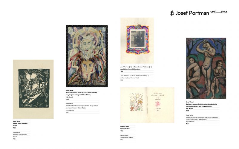
Further expanding the character across visual communication, the symbol could be developed into an illustration of the character with a whole body. This could be captured in dynamic poses, reflecting the curatorial concept of the permanent exhibition, which was based on the ever-changing principle of variability.
The characters in the illustrations would appear in pairs, a reference to a dialogue that the museum encouraged. This dialogue would therefore be on several levels – between the writer and the reader, between the real and fictitious world, between the writer and their work, etc.
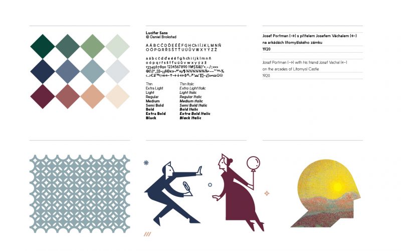
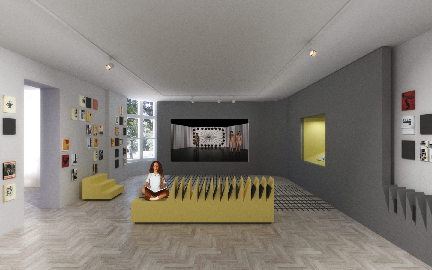
The colour palette was inspired by old bookbinding. Elegant sophisticated colours were chosen in a way that would suit the nature of the museum. The Lucifer Sans font was used as a modern and diverse sans-serif font with a wide range of gliffs, and up to three stylistic sets. For the navigation system, we used typography and icons for inside and outside the building. One of its central elements were the lines that referred to one of the writer’s basic needs – a lined sheet of paper.
Result
We didn’t win the pitch but as a learning experience, it was definitely worth it.