Deliverables
Conceptualisation
Brand creation
Graphic design
Packaging
Photography

Brief
One of the greatest things about running an owner-operated independent agency is that you get to meet and talk to other owners with whom your work has a direct impact on. Which is why we don’t shy away at all from working with family businesses. This was the case of Morous, a brand new family-owned-and-operated brewery from Rymarov, Czech Republic, who approached us with the request to create their new visual identity.
Action
The Sudetenland region, where the brewery comes from, is not very known for beer production. The hardest part was to find the balance between the product itself, plus the region and its historical heritage, and the right elements to best represent the product. We took a historical perspective and found interesting facts about this rather abandoned piece of land stuck between Czechia and Germany through offline research in a local museum.
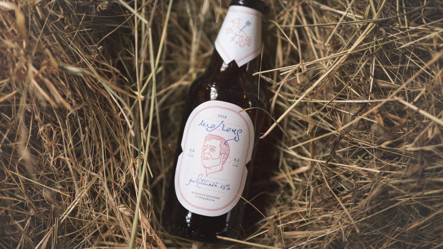
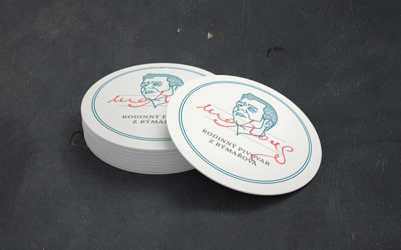
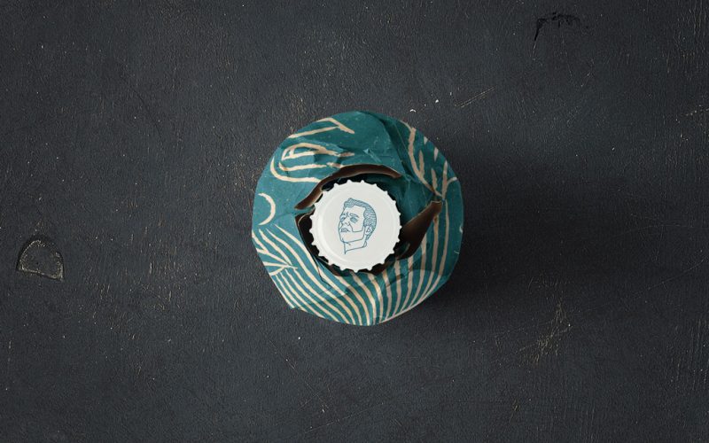
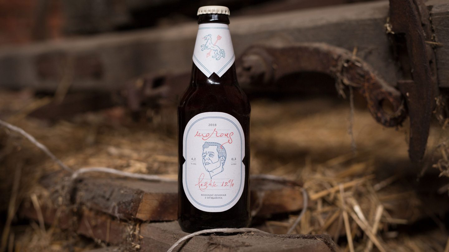
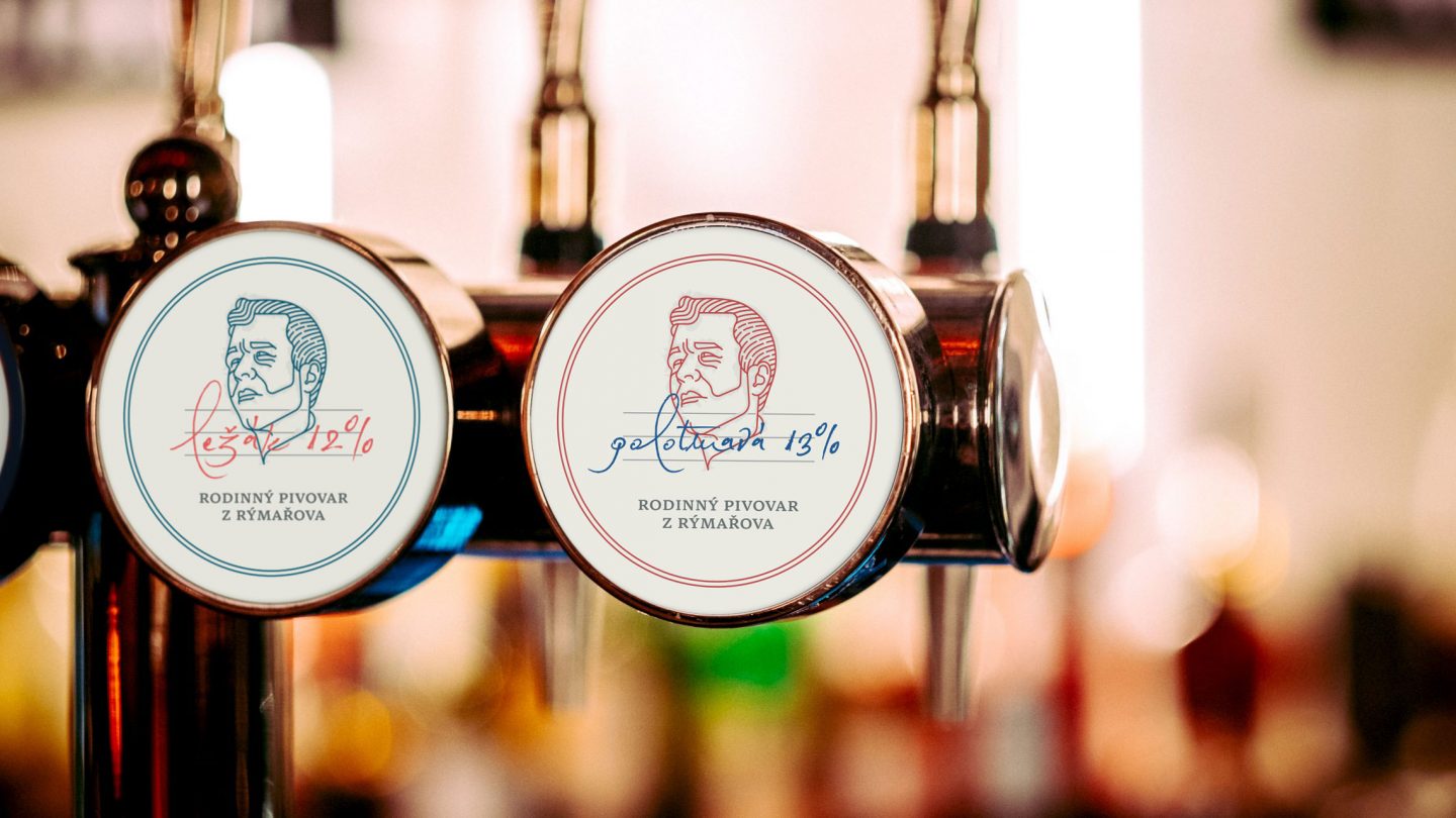
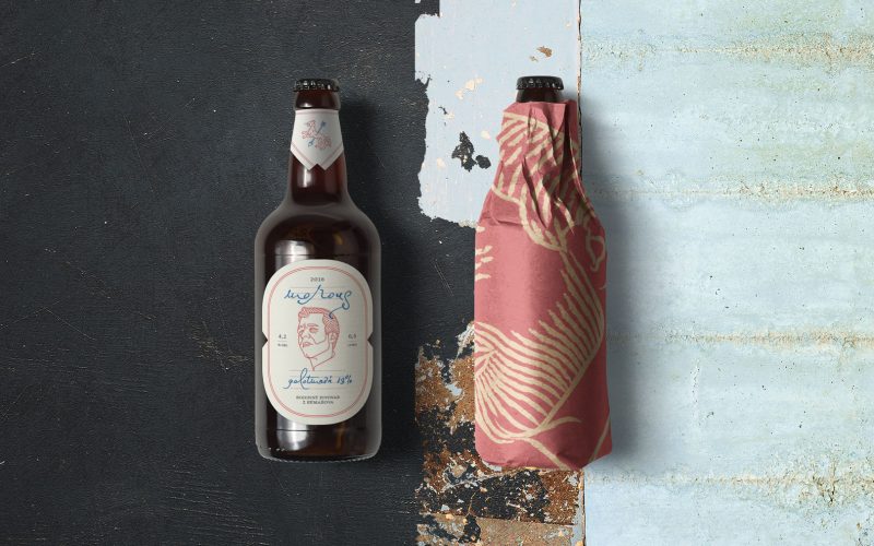
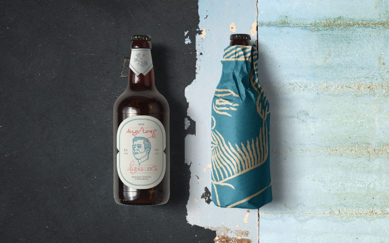
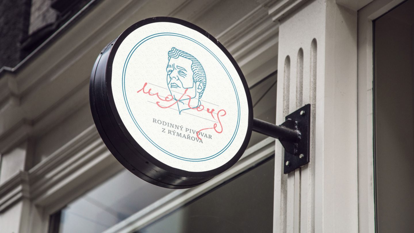
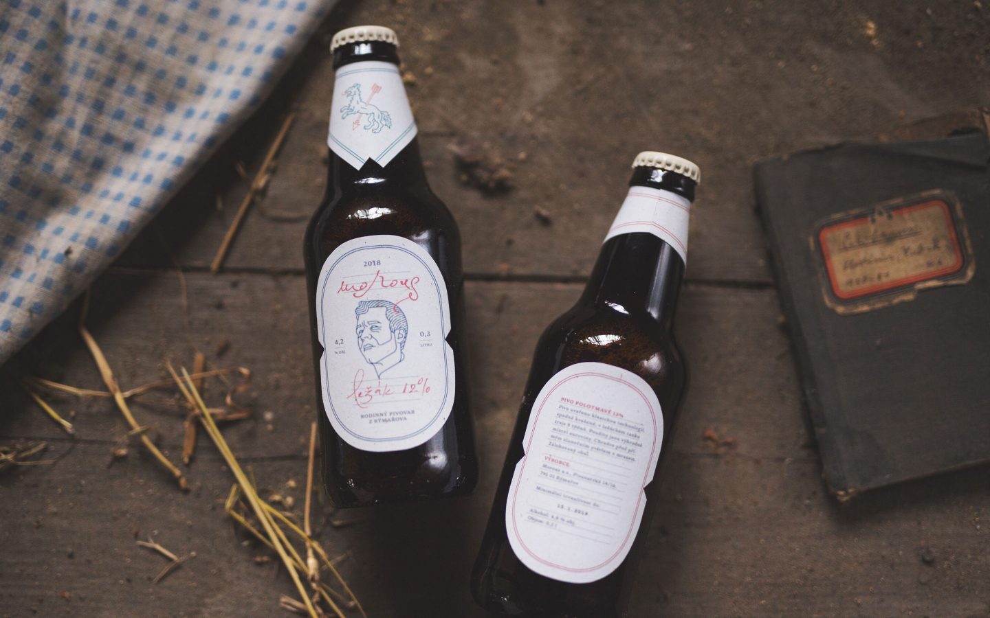
The lettering was another challenge — it had to serve two purposes: as the label headline as well as the brewery’s logo. We crafted handwritten typography with a portrait drawing, signature and a sign of the Sudetenland region with a flat background. The visual style is built on the personality of Morous’s head brewer as the main label feature and a symbol of fair attitude and beer quality. We were inspired by the character of the head brewer, said to be a grump — which translates into Czech as “Morous”. He gives the impression of being rough, cold and unbending, but in fact, he has a warm heart — just like the Sudetenland region.
Besides the portrait, there is also the wolf as a coat of arms of Rymarov, the city where the brewery is based. This is a reference to the historical events related to the Roman Empire. The handwritten signs symbolise the head brewer’s signature, which confirms the beer quality. The roughness of this region is reflected in the retro look of the labels. These symbolise a time capsule, also thanks to faded colours (made on purpose). The main thought was to make a clean design without any distracting features.
Result
The design is to be launched in 2019 across many different applications and can be further developed to match the type of beer, by changing its colours to match the different beers. Thanks to hand typography, each beer is signed by the head brewer who confirms the quality and the honesty with which the beers are made.