Team
Strategy: Jan Blazek
Creative Direction: Tom Nedved
Art Direction: Marcin Szewczyk et al.
Web UX, UI: Klara Barova
Web Design: Klara Barova
Web Build: Josef Antos, Jan Rubes, Milan Pisna
Copywriting: Jan Blazek
DOP: Radim Vanous
Voice Artist: Karl S.
Photography: Julius Filip
Legal: Jaroslav Juras (Juras & Partners)
Project Management (agency): Nikola Brezinova
Project Management (client): Jitka Noskova
Challenge
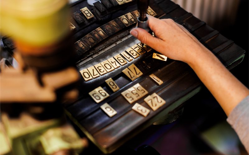
GZ is the world’s largest producer of vinyl records and a global force in Print & Packaging — a company whose success has been built not on marketing, but on exceptional craft, scale, and consistency. For years, it thrived without a dedicated marketing team, unified brand strategy, or deliberate storytelling.
That independence, even defiance, was something we at Little Greta admired — a kind of purity that’s rare in today’s world.
At the same time, everyone recognised that the visual identity, website, and communication tools no longer reflected the company’s scale or character. GZ, a global hegemon, deserved a brand presence as distinctive and powerful as its work. The task was not to gloss over reality, but to materialise the story, emotion, and ambition that had always been there.
Concept
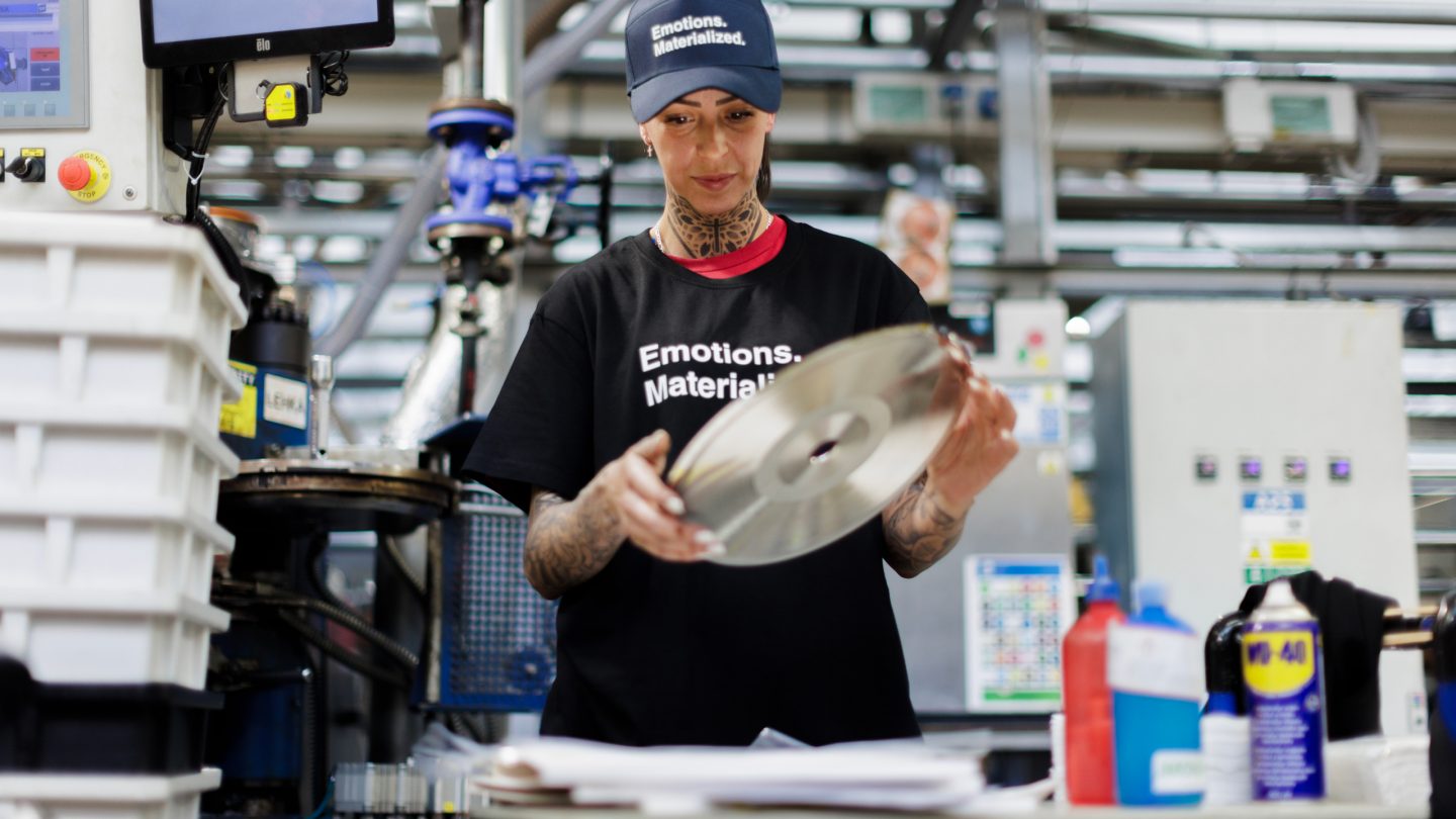
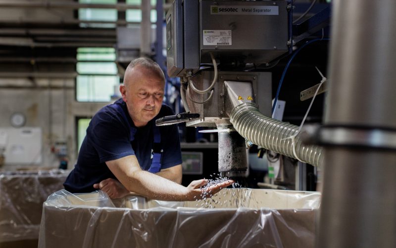
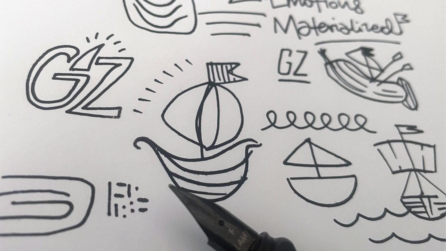
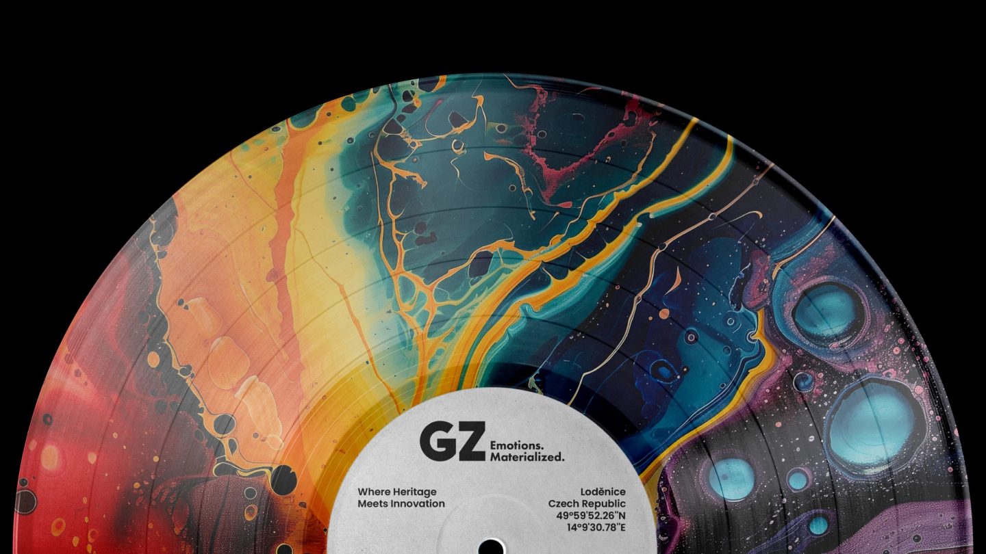
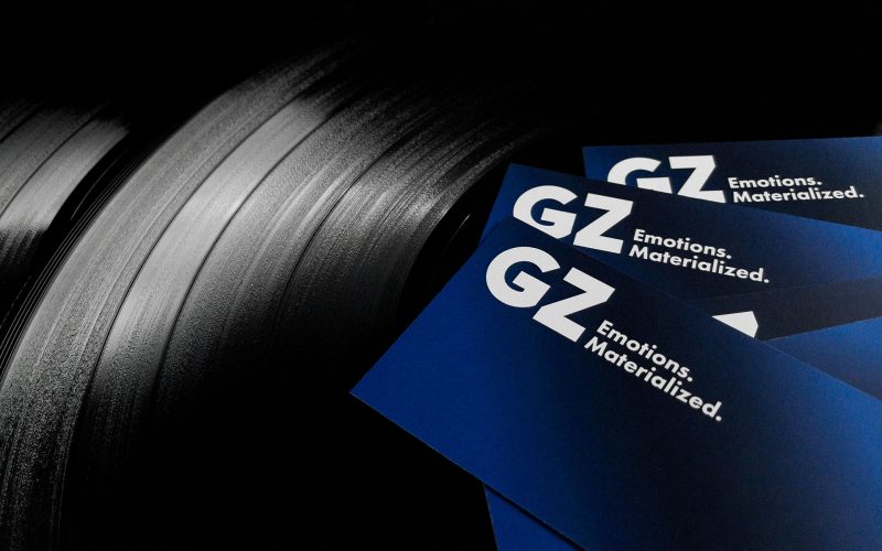
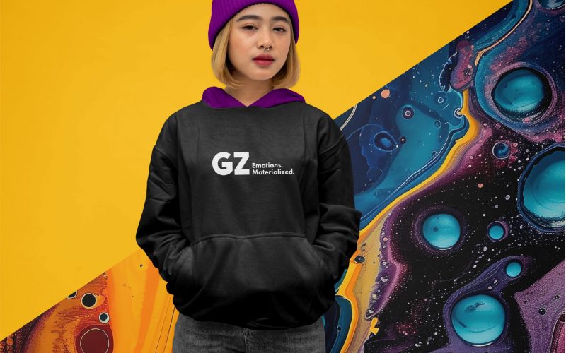
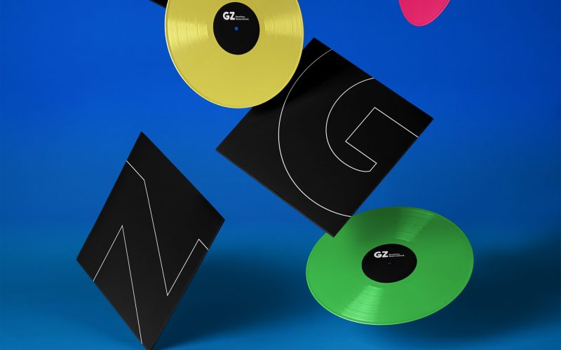
Little Greta developed a new company claim, “Emotions. Materialized.” — a distilled expression of what GZ does best: transforming raw creative energy into tangible, high-quality products for the world’s most celebrated artists and brands. This claim became the launchpad for a comprehensive visual overhaul: a confident new logo, a clean corporate typeface, and a design system inspired by coloured vinyl granules and vibrant inks. A detailed, 90-plus-page design manual was then created, covering all facets of graphic design.
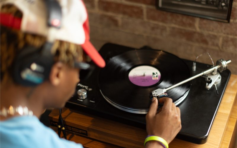
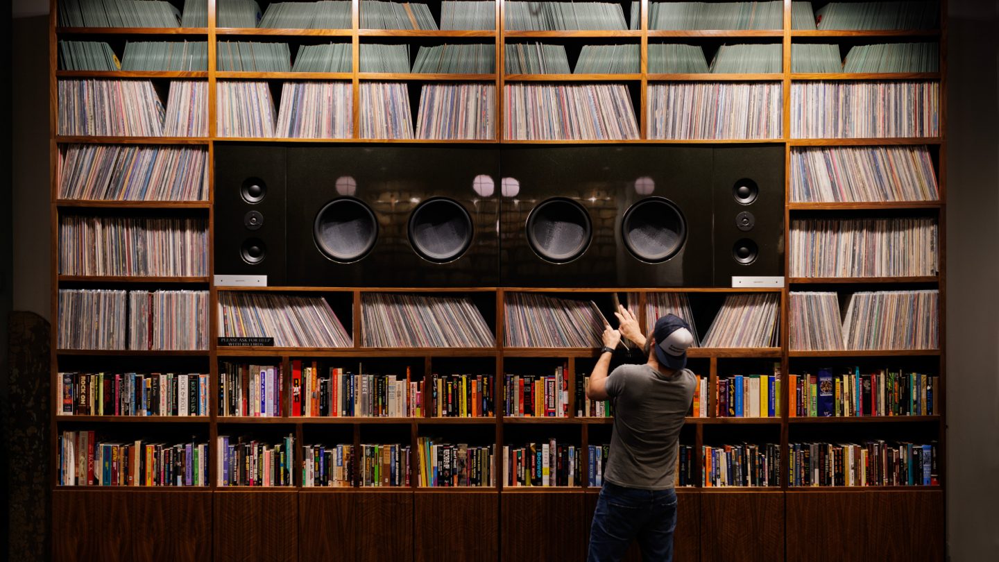
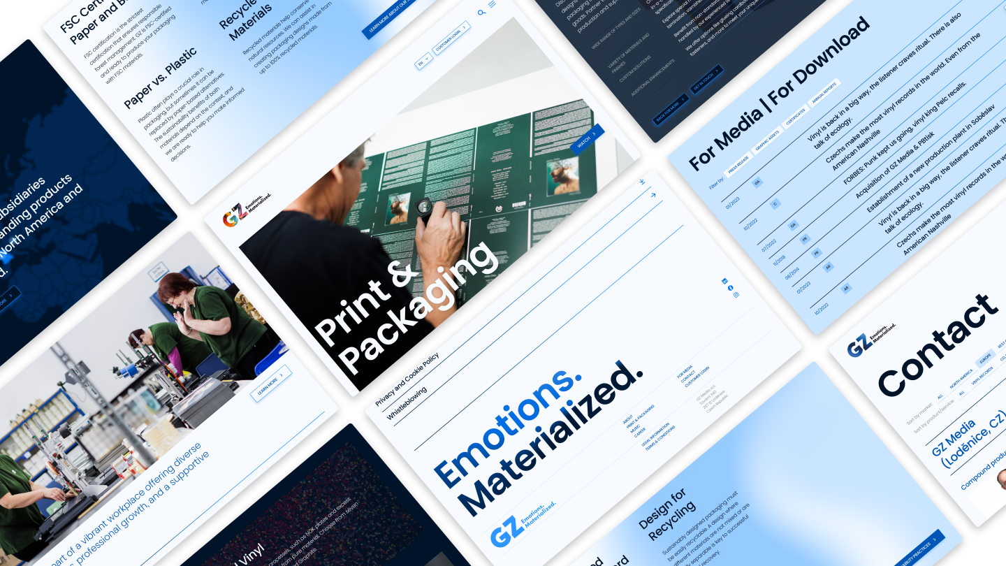
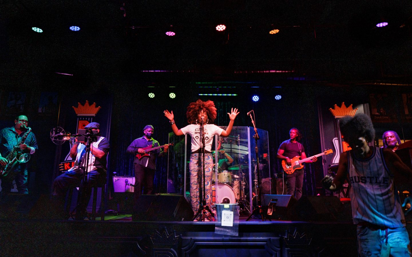
As part of the rebrand, we produced three image films — each spotlighting a different facet of the business: Corporate, Music, and Print & Packaging. Shot across GZ sites in both Europe and the US over twelve days, the films were crafted not to showcase technological capabilities — those are a given — but to evoke emotion and spark curiosity. The Corporate film reflects the company’s journey since the 1950s; the Music video plays with iconic song titles (from Billy Joel and the Rolling Stones to The Beatles) turned into playful copywriting; and the Print & Packaging piece highlights precision, colour, and craftsmanship. In parallel, we also created a full suite of image and product photography — and a completely reimagined website — to support the new visual narrative across digital and physical touchpoints.
Result
The rebrand gave GZ the clarity and confidence to match its global scale, sharpening its identity and story so it can deepen relationships, grow its presence among the world’s most iconic artists and brands, and unlock new business across continents — from its HQ in Lodenice, Czech Republic to Los Angeles, and from heritage acts to today’s chart-toppers.