Team
Strategy: Zuzana Behova
Creative Direction: Tomas Nedved
Art Direction: Milan Nguyen
Photography: Vojtech Plhak
Typography: Christian Robertson
Project Management: Zuzana Behova
Challenge
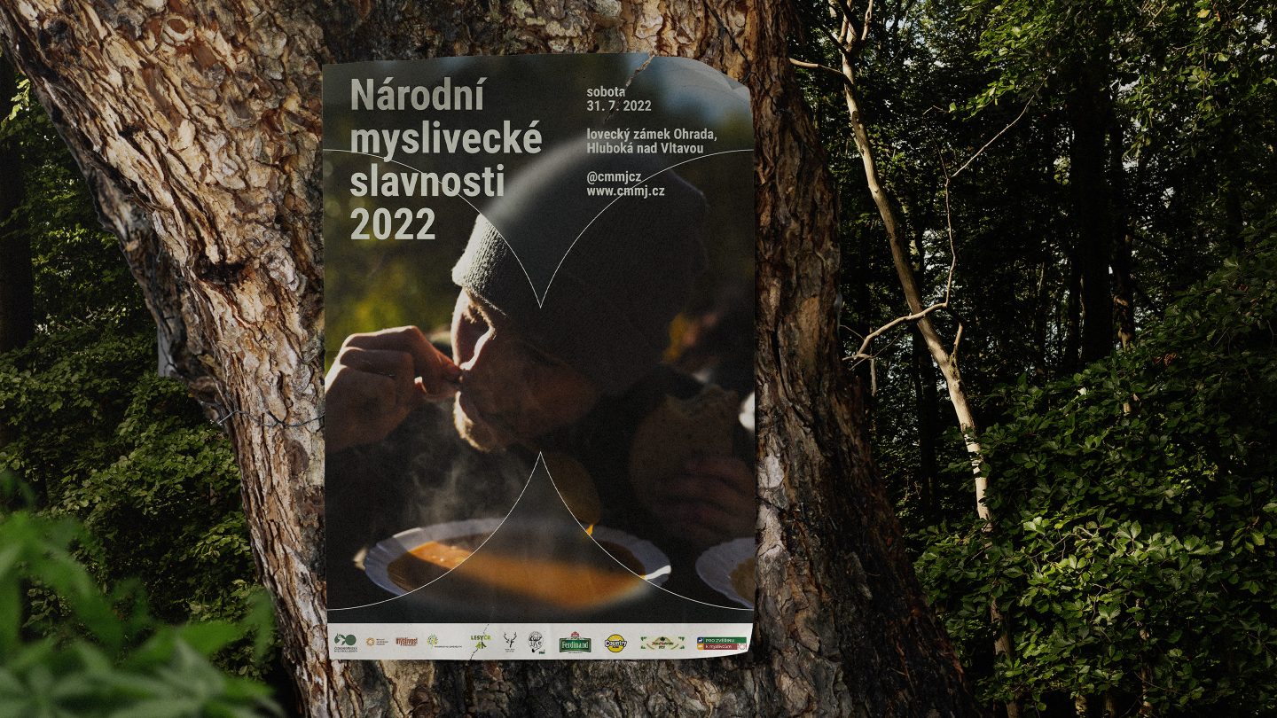
The Czech-Moravian Hunting Union has been uniting Czech, Moravian and Silesian hunters since 1923. With 55,000 members, the organisation aims to protect hunting as a cultural heritage and to care for sustainable development. They support the activities of hunters in the care of game and landscape, organise hunting tests, hunting management, hunting dog fitness tests and falconry tests.
Despite its noble mission, the organisation’s perception is somewhat stereotypical – or often downright bad (animal killers, drunks and weirdos straight out of classic Czech films like The Firemen’s Ball by Milos Forman).
To challenge this image, on the 100th anniversary of its foundation, the union announced a competition for a visual identity formally organised by Czechdesign. The goal was to replace the existing 60-year-old visual identity with a new one, thus unifying and systematising its visual presentation and strengthening communication towards both the hunting and non-hunting public.
We were one of four entities invited to pitch.
Concept
We conceived this project as part of a broader communication strategy. This approach made sense because there was a significant discrepancy between the union’s activities and their perception by the general public.
The visual identity was to symbolise this change.
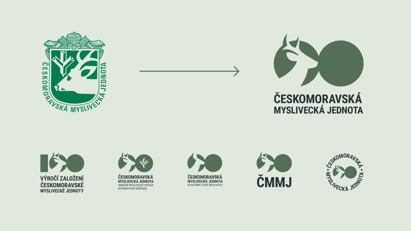
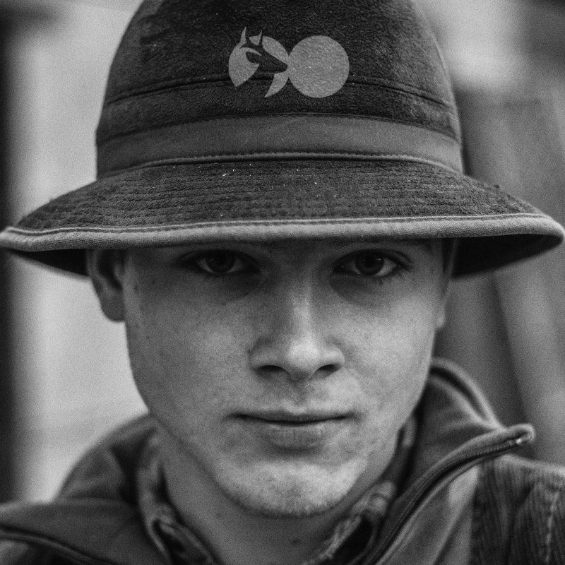
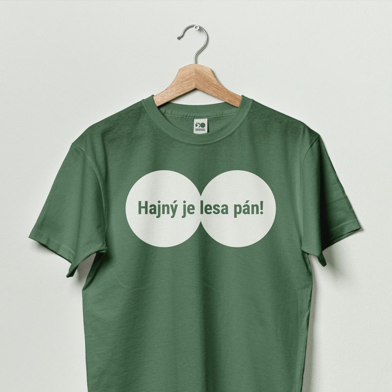
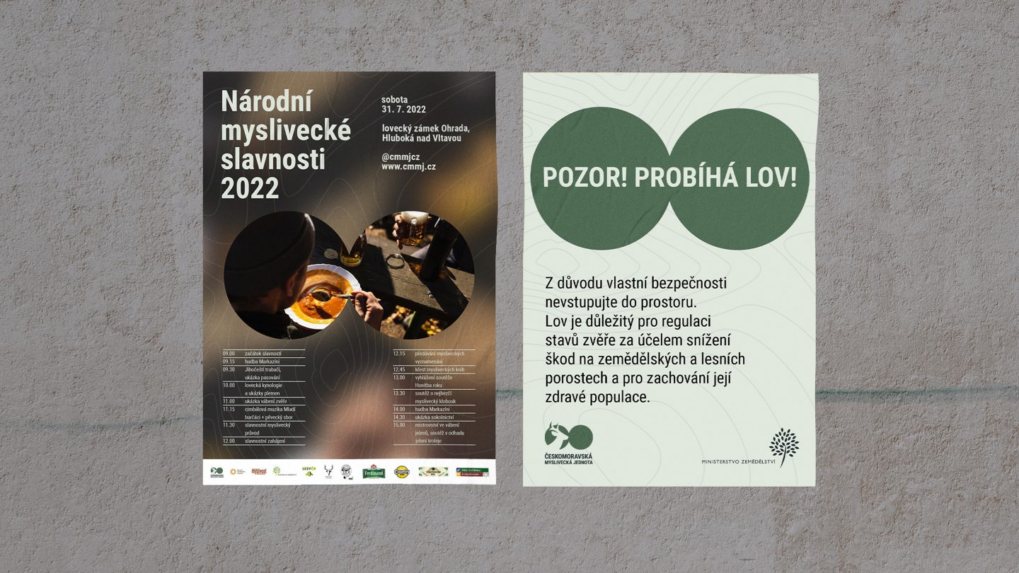
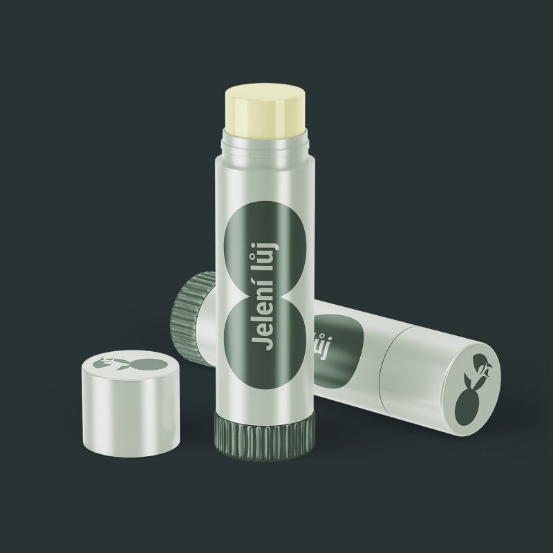
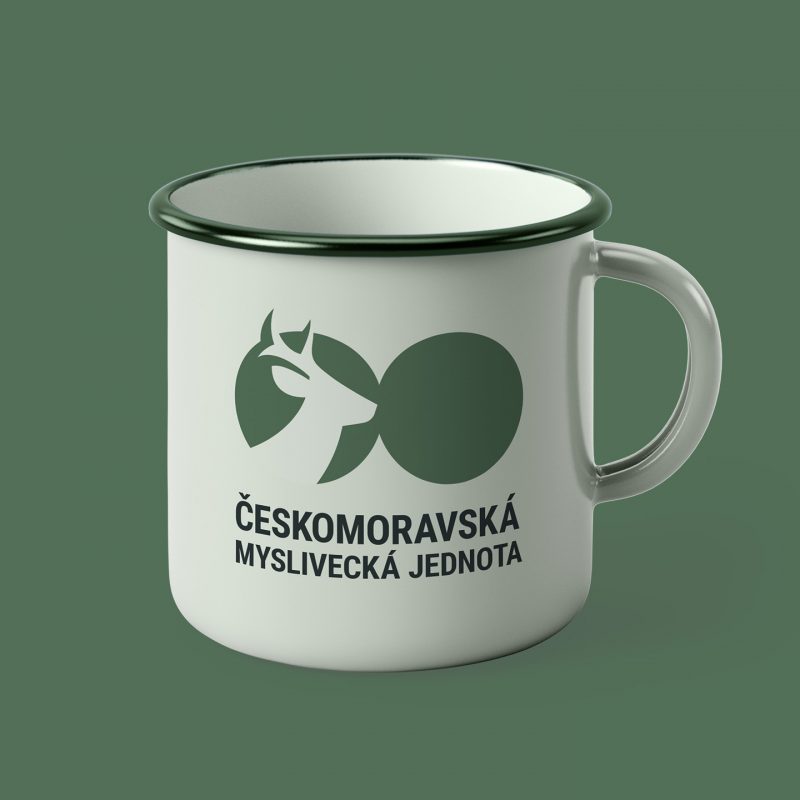
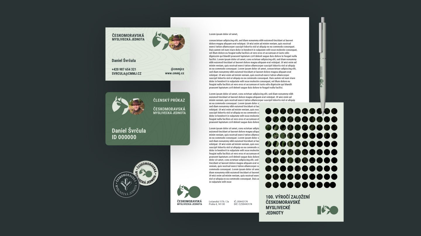
The main visual element of our concept was a circle representing the cycle of life in nature; perennial care (continuity); focus on a specific thing; an object of activity (or the whole), single purpose, goal; unity (connecting shape, part of a whole).
This was taken to the next level, as we worked with two circles representing binoculars (“to see is to know”). This represented not only shooting the game (the optics of the binoculars), but also observation, control, and care and protection (that’s why two connected circles, not one). The two circles also represented duality: hunting vs. protection; tradition vs. the modern world; nature vs. man; main organisations vs. local associations; fauna vs. flora.
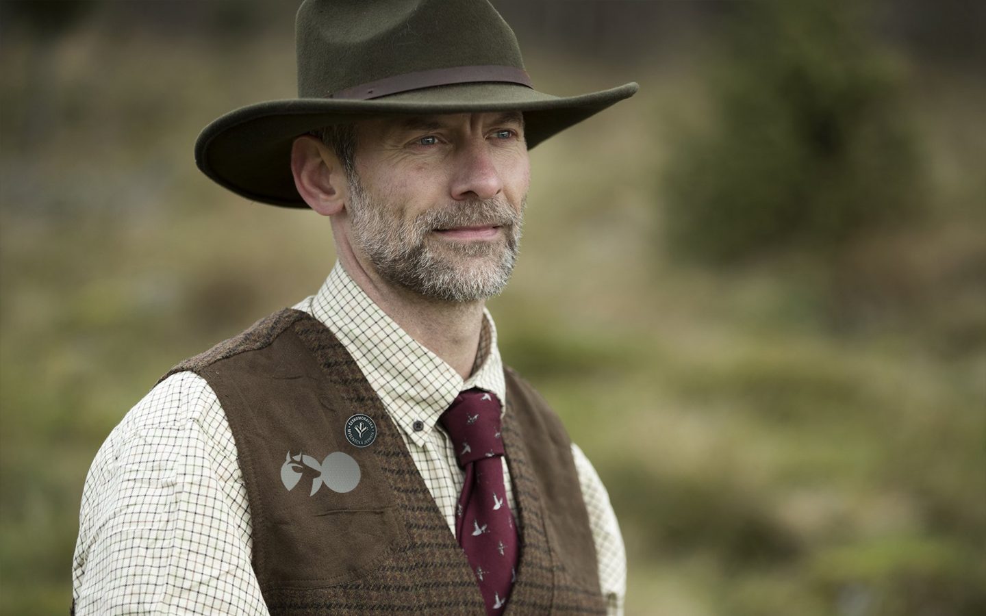
Given the organisation’s conservative DNA, the parameters of the brief were strict. For example, there was a list of mandatory elements to be included in the logo such as the deer motif or the colour (unsurprisingly green) that we had to stick to.
Result
We didn’t win the pitch but as a learning experience, it was definitely worth it.