Deliverables
Conceptualisation
UI
Graphic Design
Project Management
Brief
Creative Dock approached us because they needed a UI agency experienced in building banking/fintech-related apps. Our task was to develop UI and design for their mobile banking partner. This would be for a large CEE banking group’s greenfield startup project. The goal: become the leading platform for freelancers/SMEs needing banking and non-banking services.
Action
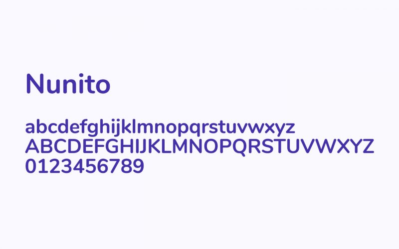
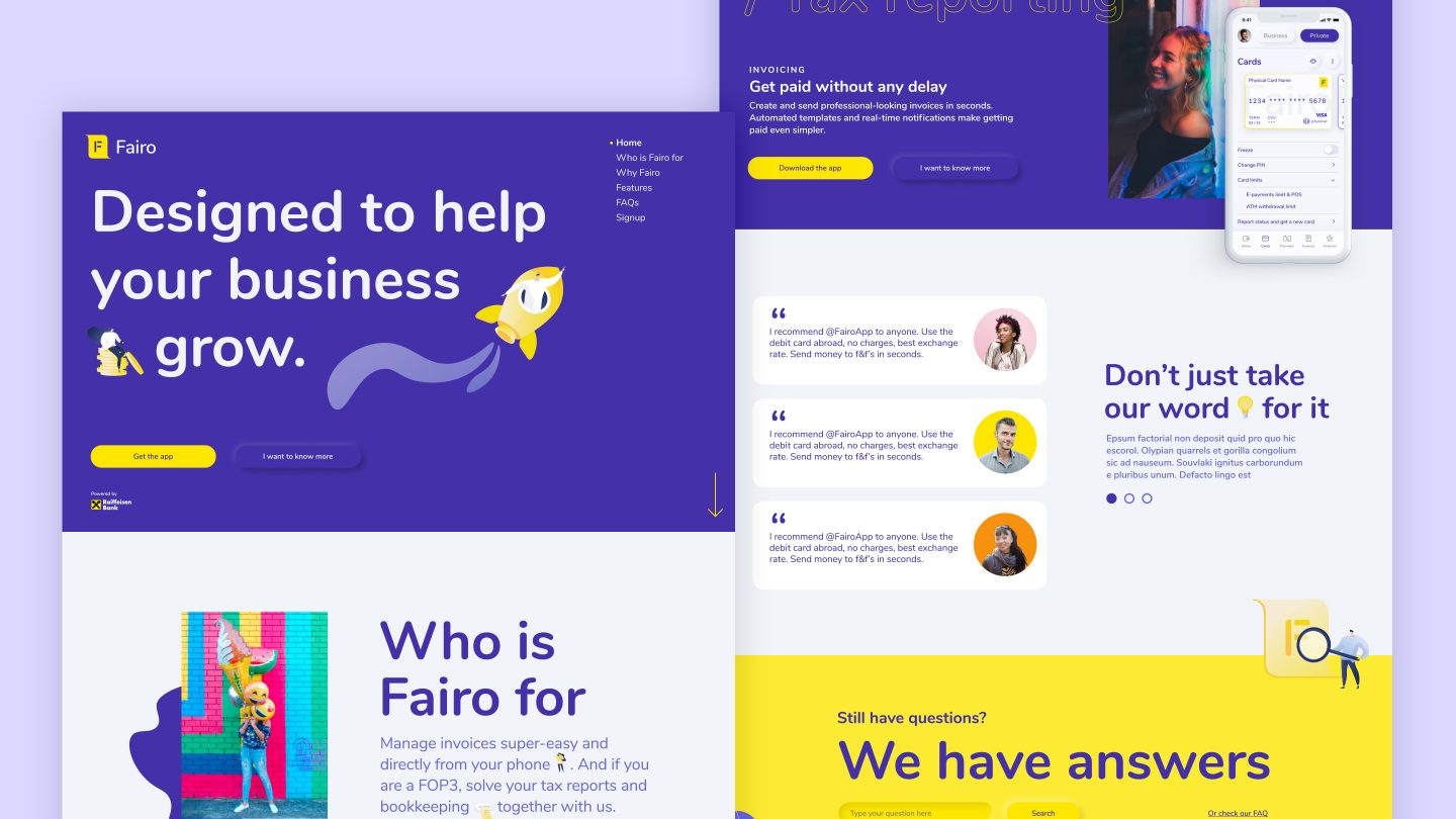
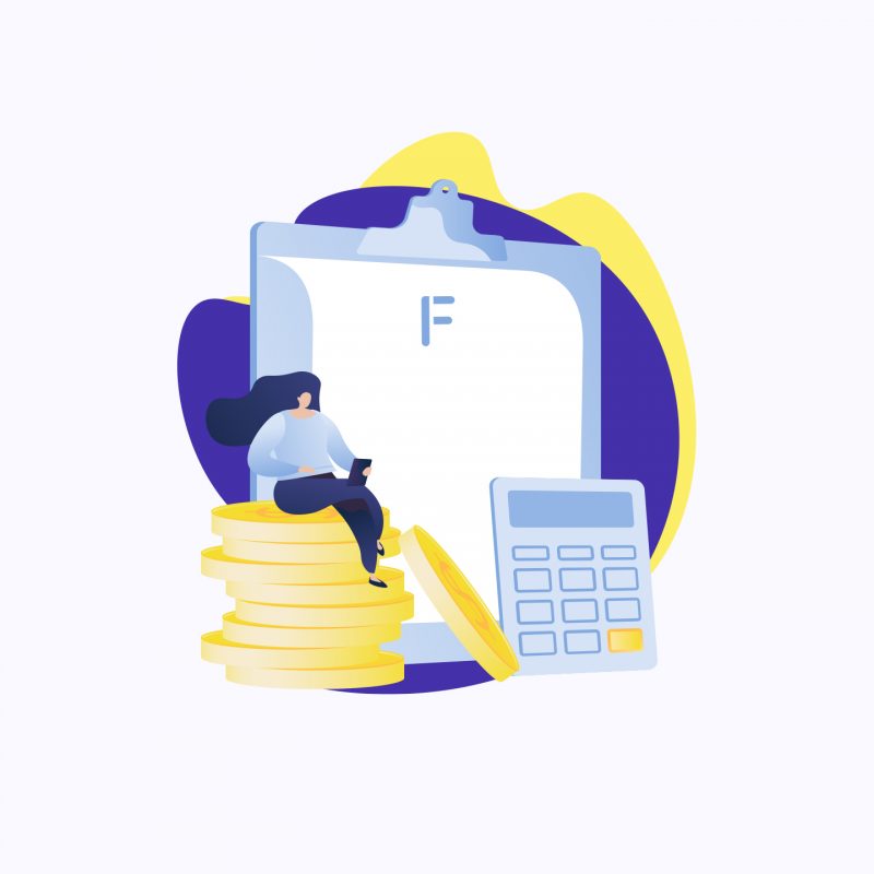
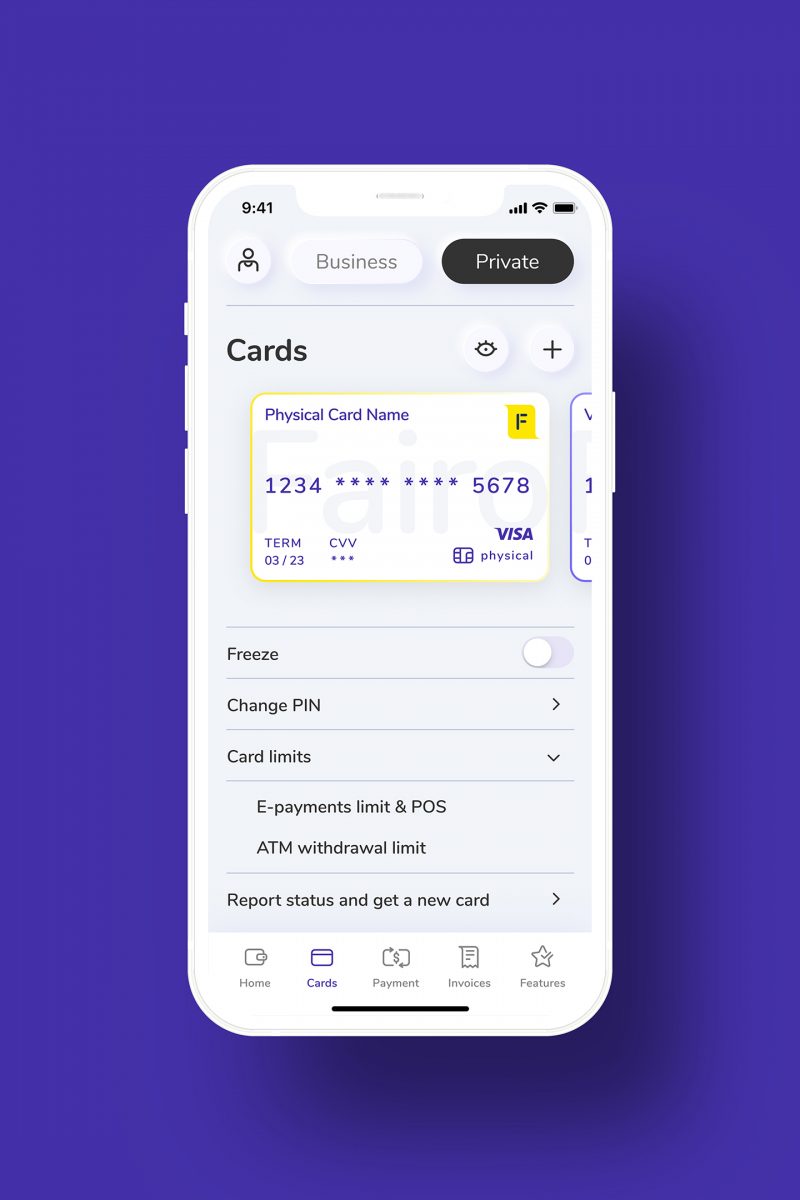
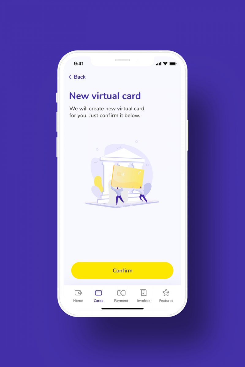
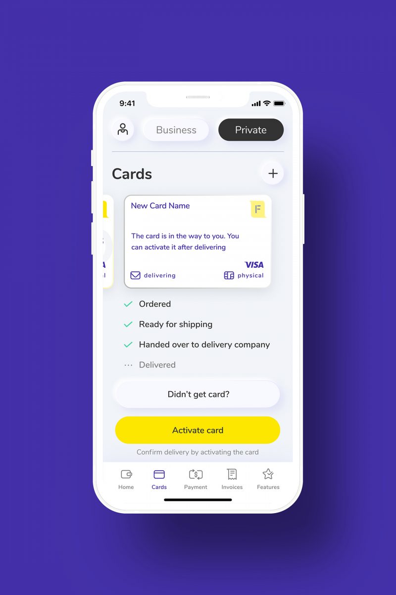
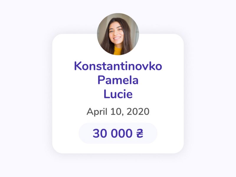
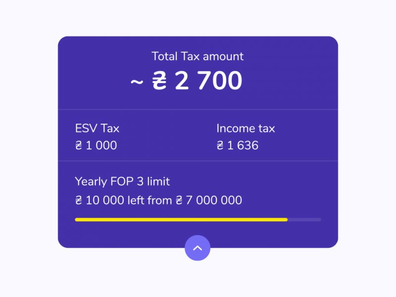
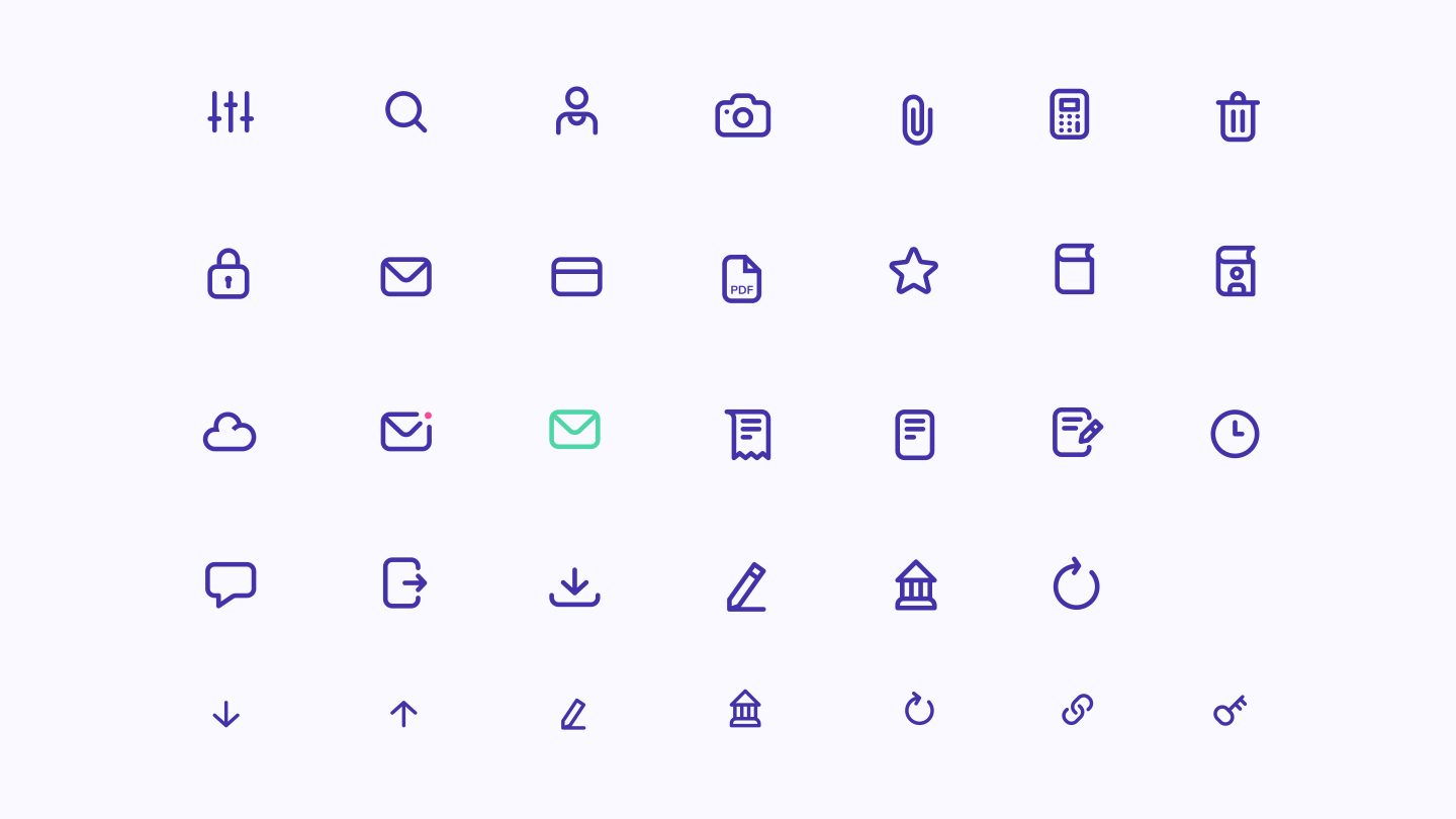
We used the brand’s existing fonts and colours in creating a minimalist and ultra-clear design. This was typography-driven, high legibility, with a dash of elegance – a combination to evoke a feeling of trust. Headlines were serif, large and contrasted to distinguish between paragraph text. Further enhancements came via separating lines, underline for selection, and soft shadows. We also deployed friendly-looking “soft” icons, bold orange as a secondary colour, with vibrant cards. For currencies, we used ISO codes to solve the problem of some currencies not having a symbol. This also made things clearer and easier for tabular data.
Result
We enjoyed working on this project immensely, and our UI designs reflected the high aspirations of this new mobile platform. With the product rollout across European markets in 2021, we look forward to using the app ourselves.

